

Late last year I published an article that described the difficulties involved with a fundamental aspect of the climate change debate – measuring global temperature trends. This article describes an analysis of a data set that compares two different ways to calculate the daily temperatures used to determine global temperature trends. Ray Sanders reproduced Stephen Connolly’s description an analysis that shows how temperature measurement techniques affect trend interpretation.
The opinions expressed in this article do not reflect the position of any of my previous employers or any other organization I have been associated with, these comments are mine alone.
Background
My fifty-odd year career as an air pollution meteorologist in the electric utility sector has always focused on meteorological and pollution measurements. Common measurement challenges are properly characterizing the parameter in question, measuring it in such a way that the location of the sensor does not affect the results, and, when operating a monitoring system, verifying the data and checking for trends. On the face of it, that is easy. In reality, it is much more difficult than commonly supposed.
I prepared the previous article to highlight recognized instrumental and observational biases in the temperature measurements. One problem is measurement methodology. The longest running instrumental temperature record is the Central England Temperature (CET) series that extends back to 1659. In the United States temperature data are available back to the mid 1800’s. In both cases the equipment and observing methodology changed and that can affect the trend. Too frequently, when observing methods change there is no period of coincident measurements that would enable an analysis of potential effects on the trends.
Only recently have computerized data acquisition systems been employed that do not rely on manual observations, and even now many locations still rely on an observer. For locations where temperature records are still manually collected, observers note the maximum and minimum temperature recorded on an instrument that measures both values daily. A bias can be introduced if the time of observation changes. If observations are taken and the max-min thermometers are reset near the time of daily highs or lows, then an extreme event can affect two days and the resulting long-term averages. Connolly’s work addresses another bias of this methodology.
Uncertainty Caused by Averaging Methodology
The issue that Stephen Connolly addressed in his work was the bias introduced when a station converts from manual measurements of maximum and minimum temperatures to a system with a data acquisition system. Typically, those data acquisiton systems make observations every second, compute and save minute averages, and then calculate and report hourly and daily averages.
Ray Sanders explained that he came across Stephen Connolly’s analysis of temperature averages based on data from the Valentia weather station on the south west of the Republic of Ireland. He asked Stephen if he could refer to his work, to which he agreed on the condition he duly credited him. So by way of a second-hand proxy “guest post” I have reproduced Stephen’s unadulterated X post at the end of this article. I offer my observations on key parts of his work in the following.
I highly recommend Connolly’s article because he does a very good job explaining how sampling affects averages. He describes the history of temperature measurements in a more comprehensive way than I did in my earlier post. He explains that the daily average temperature reported from a manual observation station calculated as the average of the maximum and minimum temperature (Taxn) is not the same as an average of equally spaced observations over a 24-hour period (Tavg). Using a couple of examples, he illustrates the uncertainties introduced because of the sampling differences.
Connolly goes on to explain that:
In 1944 Met Éireann did something a bit unusual, they started measuring the temperature every hour. Rain or shine, sleet or snow, the diligent staff of Met Éireann would go out to the weather station and record the temperature. Between January 1944 and April 2012 when the station was replaced with an automated station only 2 hours were missed.
The data enabled Connolly to compare the two techniques to calculate the daily average temperature. In his first graph he plots the difference between the two techniques as blue points. Overlaid is the 1 year rolling average as a red line. He states that Tavg is greater than Taxn in Valentia on average by 0.17oC (std deviation 0.53, N=29339, min=-2.20, max=3.20).
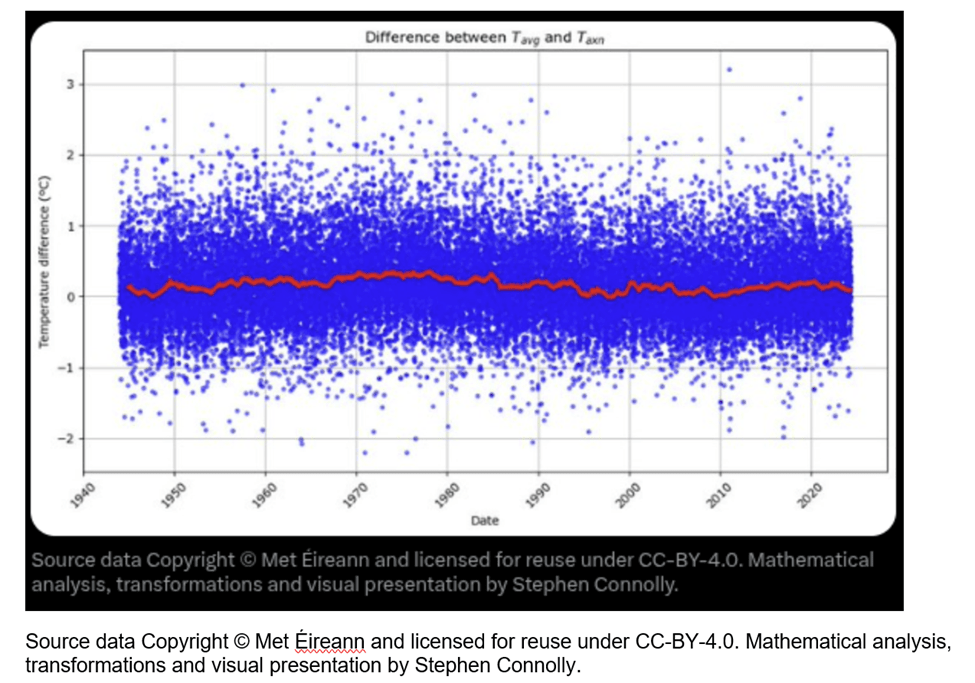
Connolly plots the difference between the two averaging approach and notes that:
If we just look at the rolling average, you can see that the relationship is not constant, for example in the 1970’s the average temperature was on average 0.35ºC warmer than the Meteorological estimate, while in the late 1940’s, 1990’s and 2000’s there were occasions where the Meteorological estimate was slightly higher than the actual average daily temperature.
He goes on:
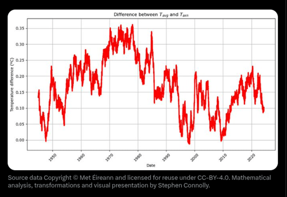
It’s important to highlight that this multi-year variability is both unexpected and intriguing, particularly for those examining temperature anomalies. However, putting aside the multi-year variability, by squeezing nearly 30,000 data points onto the x-axis we may have hidden a potential explanation why the blue points typically show a spread of about ±1ºC… Is the ±1°C spread seasonal variability?
The shortest day of the year in Valentia is December 21st when the day lasts for approximately 7h55m. The longest day of the year is June 21st when the day lasts for 16h57m. On the shortest day of the year there is little time for the sun to heat up and most of the time it is dark and we expect heat to be lost. So we expect the average temperature to be closer to the minimum temperature during the winter than during the summer.
I found this line of reasoning interesting:
We can check the seasonal effects in the difference between Tavg and Taxn by looking at a time dependent correlation. As not everyone will be familiar with this kind of analysis, I will start by showing you the time dependent correlation of Tavg with itself in the following graph.
The x-axis is how many days there are between measurements and the y-axis is the Pearson correlation coefficient, known as r, which measures how similar measurements are averages across all the data. A Pearson correlation coefficient of +1 means that the changes in one are exactly matched by changes in the other, a coefficient of -1 means that the changes are exactly opposite and a correlation coefficient of 0 means that the two variables have no relationship to each other. The first point on the x-axis is for 1 day separation between the average temperature measurements.
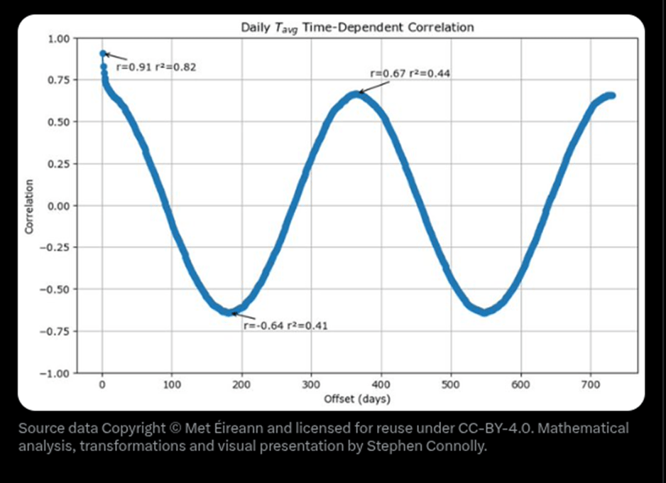
When I was in graduate school, a half century ago weather forecasting performance was judged relative to two no-skill approaches we called persistence and climatology. Connolly explains that persistence is assuming that “Tomorrow’s weather will be basically the same as today’s”. This graph shows that the approach is approximately 82% accurate.
The graph also illustrates the accuracy of the second no-skill forecast – climatology. In other words the climatology forecast for the average temperature is simply the average for the date. At a year separation the r value of 0.67 days that 44% of today’s average temperature can be explained as seasonal for this time of year. What this means is that actually the persistence forecast is only explaining 38% better than the climatological forecast
Connolly notes that the maximum and minimum temperatures behave the same and concludes that the above graph basically tells us what to expect when something is strongly seasonal.
Connolly goes on to ask what happens when we plot the time-dependent correlation of Tavg-Taxn? He shows the results in the following graph.
The 1 day correlation is 0.19, this tells us that approximately 4% of today’s correction factor between Tavg and Taxn can be predicted if we know yesterday’s correction factor. The seasonality is even worse, the 6 month correlation coefficient is -0.02 and the 1 year correlation coefficient is +0.07.
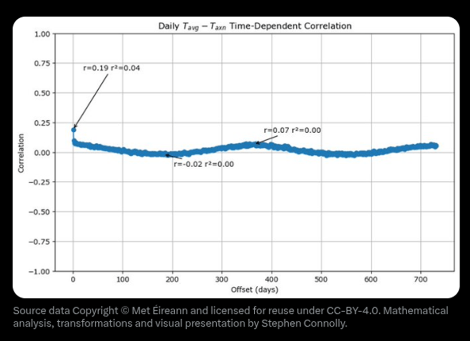
He points out that this answers the question whether this is seasonal variability and concludes that the ±1°C spread is not seasonal variability. The important point of this work is that this means that if we only know daily average temperature based on the average of the maximum and the minimum temperature then comparison to the average measured using a data acquisition system the two methodologies could be anywhere between ±1°C different
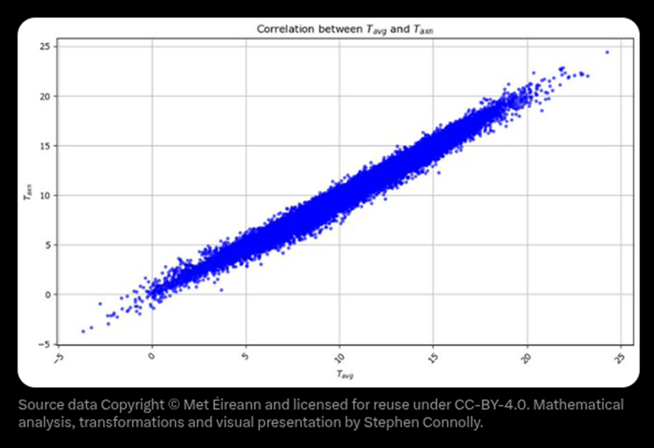
He provides another graph to illustrate this.
The x-axis is Tavg and the y-axis is Taxn. Now obviously when the average daily temperature is higher, the average of the minimum and maximum temperatures is also higher and so we get a straight line of slope 1, but the thickness of the line represents the uncertainty of the relationship, so if we know Taxn is say 15°C then from this graph we can say that Tavg is probably between 13.5°C and 16.5°C.
Here is the important point:
Now because most weather stations were not recording hourly until recently, most of our historical temperature data is the Taxn form and not the Tavg. That means that if Valentia is representative then the past temperature records are only good to ±1°C. If somebody tells you that the average temperature in Valentia on the 31st of May 1872 was 11.7°C, the reality is that we just do not know. It’s 95% likely to have been somewhere between 10.6ºC and 12.7ºC.
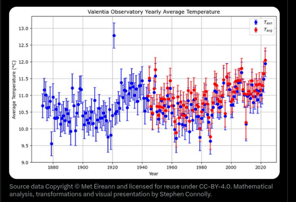
He ends his analysis with another graph
In this last graph the blue points show the average Taxn of each year at Valentia since 1873 with vertical error bars showing the 95% confidence interval. The red points show the average Tavg for each year starting from 1944 with error bars showing the annual variation. The blue poking out from under the red shows the difference, even on the scale of a yearly average between the Meteorologist’s estimate of average temperature and the actual average temperature.
Discussion
Connolly explains:
Valentia Observatory is one of the best weather stations globally. the switch to automated stations in the 1990s, we can now get precise average temperatures. Thanks to the meticulous efforts of past and present staff of Valentia Observatory and Met Éireann, we have 80 years of data which allows comparison of the old estimation methods with actual averages.
The takeaway from Connolly’s evaluation of these data is that out “historical temperature records are far less accurate than we once believed.”
I second Sanders acknowledgements of the work done by Connolly:
I would like to thank Stephen for allowing me to refer to his excellent research. Whatever one’s views are on the validity of the historic temperature record of the UK, this evaluation has again highlighted one area of many where there are significant questions to be asked regarding long term accuracy.
Conclusion
I would like to thank Stephen for allowing the posting of this excellent research. One fundamental truth I have divined in my long career is that observed data are always more trustworthy than any model projection. However, there are always limitations to the observed data that become important when trying to estimate a trend.
I think these results are important because they highlight an uncertainty that climate catastrophists ignore. I will concede that average temperatures are likely warming but the uncertainty around how much is within the observational uncertainty. In other words, the claims the magnitude of the observed warming is not known well. The science is not settled on the amount of warming observed.

I guess this would suggest that reporting global annual temperature anomalies to two decimal place precision is a “sick joke”.
LikeLiked by 1 person