
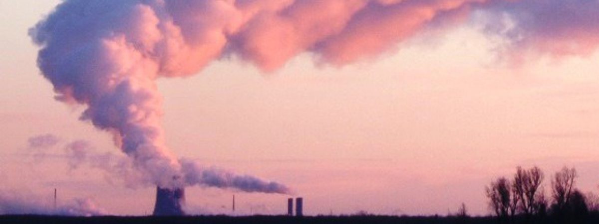
I do not think that the general public understands how much improvement there has been to New York State’s air quality and how big the emissions reductions have been. This is a summary of the trend of observed levels of SO2, NO2 and ozone since 1980 in New York State and it shows significant improvements. This is a companion to an earlier post showing emissions trends.
I have to apologize for my inability to incorporate tables and graphs in the body of a WordPress blog post. If I had that ability then this post would be a heck of a lot easier to read. Instead I offer three alternatives. Each of the figures and tables is available by links in the following post. I also have prepared a pdf version of this post and you can view that entire document NYS Air Pollution Concentration Trends. Finally that document and a spreadsheet with the data, tables and graphs are available at the NY Pragmatic Environmentalist dropbox.
Although the Environmental Protection Agency has a good air quality trend website, it does not have New York only data available and the NYS Department of Environmental Conservation does not provide a summary of air quality trends. In order to assess New York trends I accessed ambient monitoring data from an EPA website. I made no attempt to limit the monitoring sites used. I just calculated values for all reporting stations. As a result this is not an accurate picture of trends because changing stations can skew the results.
According to the EPA air quality Status and Trends document national air quality levels have decreased significantly from 1990 to 2017:
- Carbon monoxide -77%
- Lead – 80%
- Nitrogen Dioxide (annual) – 56%
- Nitrogen Dioxide (1-hour) – 50%
- Ozone – 22%
- Particulate Matter (2.5µ) (annual) – 41%
- Particulate Matter (2.5µ) (24-hour) – 40%
- Sulfur Dioxide – 88%
For the New York only data I found the following reduction trends:
- Nitrogen Dioxide (annual) – 52%
- Nitrogen Dioxide (1-hour) – 63%
- Ozone – 23%
- Sulfur Dioxide – 93%
New York State annual average ambient (SO2, NO2 and Ozone) trends are shown in Figure 1 NYS Ambient Concentration Trends NYS Trend Summary for SO2 NO2 and Ozone.
In order to compare the air quality to the National Ambient Air Quality Standards I need to show the data in the appropriate reporting format. The standards use complicated averages so the following graphs use the appropriate parameters.
The most problematic pollutant is ozone. The Ozone standard is the 0.070 ppm measured as the annual fourth-highest daily maximum 8-hour concentration, averaged over 3 years. Figure 2 NYS Maximum Annual Ambient 8-hr 4th High Ozone shows the trend of the highest observed value of the fourth-highest daily maximum 8-hour concentration. While averaging over 3 years reduces the values somewhat clearly New York is close to the standard. The highest value in 1988 was 0.148 and in 2017 the observed value was 0.079.
EPA recently instituted a one-hour NO2 standard of 100 ppb measured as the 98th percentile of 1-hour daily maximum concentrations averaged over 3 years. I did not include the 3-year averaging component but Figure 3 NYS Maximum Annual Ambient NO2 Max 98th Percentile shows the trend of the maximum observed annual value in the state. There are no observed values greater than the standard.
EPA also has a 1-hour NAAQS for SO2. That limit is 75 ppb measured as the 99th percentile of 1-hour daily maximum concentrations, averaged over 3 years. I did not average these values either so Figure 4 NYS Maximum Annual Ambient NO2 Max 98th Percentile shows the trend of the maximum observed value. There has been a sharp decline in observed values until 2017 when a higher value was observed. That is the result of adding data from a new private monitoring network specifically designed to determine whether there is an issue with this limit for their facility. In 2017 that monitor recorded a 90.5 ppb value for the 99th percentile.
The spreadsheet, NYS EPA Data for SO2 NO2 and Ozone, lists all the monitoring data for those parameters since 1980. Because of the size of that spreadsheet I did not include it. The spreadsheet included at the dropbox has a summary tab with the data and graphs for the information shown in this post.
