Balancing the risks and benefits of environmental initiatives
July Climate Alarmism
It seems that every day we are faced with another claim that we are facing an existential threat from climate change and the proof is right in front of us. So simple, so obvious and so wrong. I do not have time to do my own analysis so I am going to use the work of others to rebut the fear mongering stories about these events tied to climate change in July.
July was the Hottest Month Ever
The story that July was the hottest month in 120,000 years is the best example of the media glomming on to a story that does not stand up to scrutiny. A post at Watts Up With That explains:
Via The Australian: Cliff Mass, professor of Atmospheric Sciences at University of Washington, said the public was being “misinformed on a massive scale”: “It‘s terrible. I think it’s a disaster. There’s a stunning amount of exaggeration and hype of extreme weather and heatwaves, and it’s very counter-productive,” he told The Australian in an interview. “I’m not a contrarian. I‘m pretty mainstream in a very large [academic] department, and I think most of these claims are unfounded and problematic”. …
Professor Mass said the climate was “radically warmer” around 1000 years ago during what’s known as the Medieval Warm Period, when agriculture thrived in parts of now ice-covered Greenland. “If you really go back far enough there were swamps near the North Pole, and the other thing to keep in mind is that we‘re coming out of a cold period, a Little Ice Age from roughly 1600 to 1850”.
#
John Christy, a professor of Atmospheric Sciences at the University of Alabama at Huntsville, said heatwaves in the first half of the 20th century were at least as intense as those of more recent decades based on consistent, long-term weather stations going back over a century. “I haven‘t seen anything yet this summer that’s an all-time record for these long-term stations, 1936 still holds by far the record for the most number of stations with the hottest-ever temperatures,” he told The Australian, referring to the year of a great heatwave in North America that killed thousands.
Professor Christy said an explosion of the number of weather stations in the US and around the world had made historical comparisons difficult because some stations only went back a few years; meanwhile, creeping urbanization had subjected existing weather stations to additional heat. “In Houston, for example, in the centre it is now between 6 and 9 degrees Fahrenheit warmer than the surrounding countryside,” he explained in an interview with The Australian.
Professor Christy, conceding a slight warming trend over the last 45 years, said July could be the warmest month on record based on global temperatures measured by satellites – “just edging out 1998” – but such measures only went back to 1979.
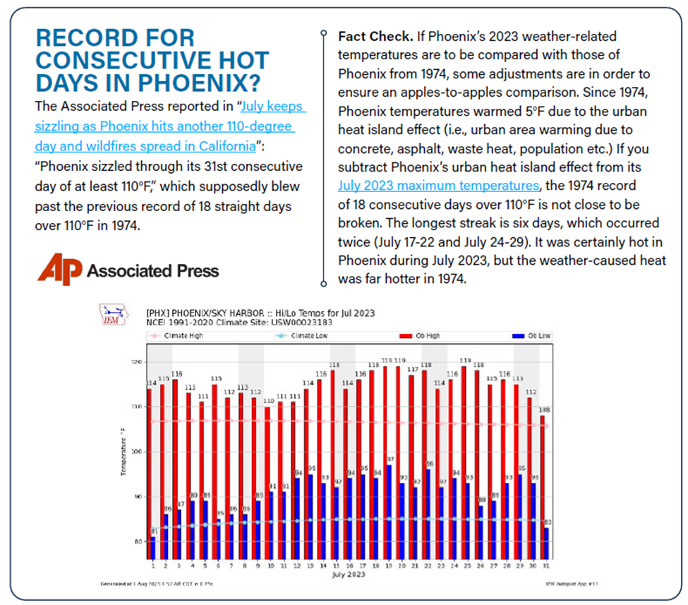
Phoenix Heat Wave
Phoenix Arizona had a streak of 31 days when the high temperature was 110 degrees or higher. The article, “Explaining The Heat Wave: Separating Weather From Climate Change,” claims that recent warming trends in Phoenix, Arizona are due primarily to increasing atmospheric carbon dioxide levels in the atmosphere. However, this is false because data show that the high levels of warming, especially at night and as measured at an airport, are primarily due to urbanization over time, with the modest warming of the past hundred-plus years playing a very small part in comparison. Another rebuttal notes:
But, it must be climate change, look how hot it was!” My dear readers, that’s why they named it Death Valley. The Monthly Report from the U.S. National Weather Service for the Death Valley station shows that every day during July this year, the average daily temperature (Daily Maximum + Daily Minimum divided by 2) was in excess of 100 °F (37.7 °C). That’s the average! The daily highs were above 110 °F (43 °C) every single day, above 120 °F (49 °F) twenty of the days.
Is this unusual? Is this “extreme”? No, the U.S. National Park Service reports on the general the Weather in Death Valley: “Death Valley is famous as the hottest place on earth and driest place in North America. The world record highest air temperature of 134°F (57°C) was recorded at Furnace Creek on July 10, 1913. [ emphasis mine – kh ] Summer temperatures often top 120°F (49°C) in the shade with overnight lows dipping into the 90s°F (mid-30s°C.) Average rainfall is less than 2 inches (5 cm), a fraction of what most deserts receive. Occasional thunderstorms, especially in late summer, can cause flash floods.” All of those conditions, except the record high temperature of 1913, occurred this summer in Death Valley, just as the National Park Service advised visitors to expect. There was not any extreme weather, it was usual weather for Death Valley.
Climate Fact Check
If you want short rebuttal summaries to these and other false climate change stories for July check out this fact check report. It covers the following stories: monthly average temperature is the hottest, the UN proclamation that we are in an era of global boiling, the hottest day in 125,000 years, Atlantic current to collapse by 2025, record for hot days in Phoenix, hottest day in Death Valley, emissions causing hot oceans, hottest seawater ever, and more.
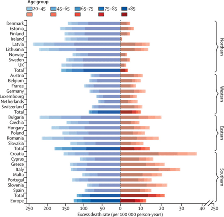
Heat Health Impacts
The rationale for alarm for the excessive heat stories is the argument that heat results in more deaths than any other weather-related event. Five years ago I explained why there are analyses that find “most of the temperature-related mortality burden was attributable to the contribution of cold”. Studies that show that extreme heat results in more deaths than any other weather-related event use a data base that only includes direct deaths. An epidemiological study that does include indirect deaths concludes most deaths are associated with moderate cold weather. Roger Pielke Jr. reports how this information can be presented to support the alarmist version:
The Lancet was caught red-handed publishing a figure that, to be as fair as possible, lent itself to misinterpretation (it was first called to my attention by Bjorn Lomborg and is in a paper by Masselot et al. 2023).
Take a look and decide for yourself. Here is the original figure comparing mortality from cold (blue) and heat (orange) in Europe from 2000-2019.
And here is how it looks when the data is graphed using a consistent scale.
Another Examples of Propaganda
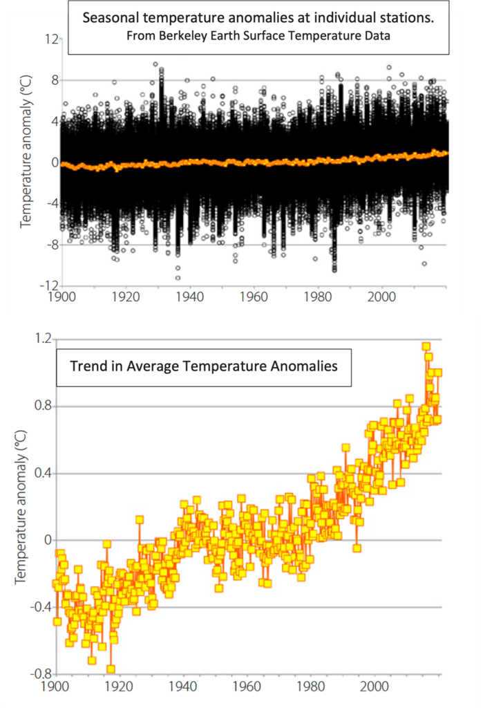
We have all seen the graphs that show inexorable global warming. However this article describes how “alarmist scientists have scared the bejesus out of people by turning a very small temperature change into a monster.” Jim Steele writes:
Dr. Lindzen graphed the average seasonal anomalies for each weather station in the BEST temperature data base from 1900 to the present. A station’s anomaly is defined as any deviation from its 30-year mean. The results are not very scary. On any given day about half the weather stations experience warm anomalies while half experience cooling anomalies.
Most anomalies cluster between ± 4°C (+/- 7.2°F) causing each data point to merge into the thick black band of the graph. Still, larger anomalies are not uncommon, so the y-axis of the above graph scales between ± 12°C (+/- 21.6°F). The yellow dots represent the average for those anomalies on any given day. We see a small trend that is relatively tiny compared to the variation in actual temperatures. Not very scary either.
So, the showtime graphs isolate the average anomalies from reality, as done in the bottom graph. Now the scale on the y-axis only spans from -0.8°C (-1.4°F) to 1.2°C (2.2°F), turning a small 1°C (1.8°F) rise over 120 years into the illusion of a monster increase. That allows click-bait media, alarmists scientists and politicians to claim that climate change could lead to mass extinctions.
Reporting Issues Influence Results
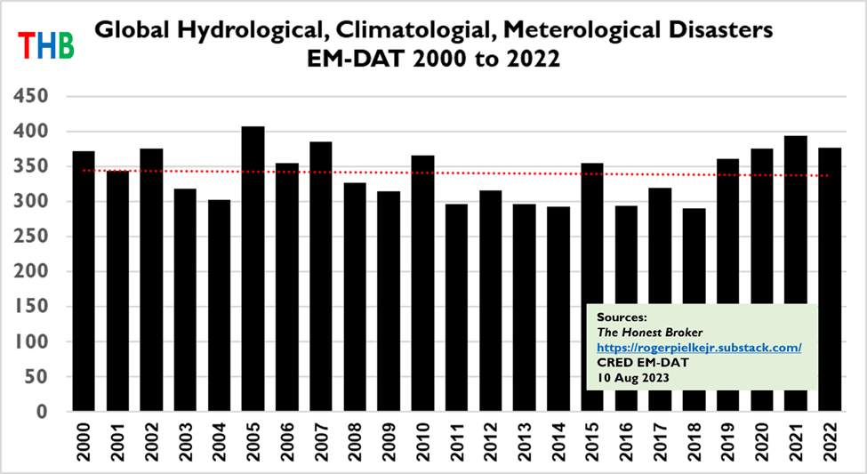
Roger Pielke Jr. is an expert on the topic of global disaster accounting. He recently posted an article that makes two relevant points to this post:
Below is the updated time series of global hydrological, climatological and meteorological disasters in the EM-DAT database, along with the linear trend, over the period 2000 to 2022.
You can see that there is no upwards trend. This lack of trend has not been reported by anyone in the legacy media (and I would be happy to be corrected). However, the completely false notion that global weather and climate disasters have increased and will continue to increase is commonly reported in the legacy media, buoyed by the promotion of false information by organizations that include the United Nations. In 2020 the U.N. claimed falsely of a “staggering rise in climate-related disasters over the last twenty years.”
The second point he makes is careful examination of the disaster data clearly shows that “the increase in disasters in its database to 2000 is due to better reporting, and not changes in underlying counts of actual disasters.” He concludes: “Regardless what happens with trends in disaster counts, it is absolutely essential to remember that if you are looking for a signal of changes in climate — always look directly at weather and climate data, not data on economic or human impacts.”
Conclusion
There is a constant barrage of doom and gloom articles connecting any extreme weather event or disaster to the existential threat of climate change. In my opinion they all are more propaganda than unbiased reporting. Every time I have checked a weather event attributed to climate change claim on my own, I have found that the issue is more complex and less threatening than portrayed. Don’t get scared by these stories!
I am a meteorologist (BS and MS degrees), was certified as a consulting meteorologist and have worked in the air quality industry for over 40 years. I author two blogs. Environmental staff in any industry have to be pragmatic balancing risks and benefits and (https://pragmaticenvironmentalistofnewyork.blog/) reflects that outlook. The second blog addresses the New York State Reforming the Energy Vision initiative (https://reformingtheenergyvisioninconvenienttruths.wordpress.com). Any of my comments on the web or posts on my blogs are my opinion only. In no way do they reflect the position of any of my past employers or any company I was associated with.
View all posts by rogercaiazza