

The New York Draft State Energy Plan is currently out for comments. While I have submitted oral comments at three hearings I have no intention of preparing detailed written comments on many topics because there is no indication that the New York State Energy Research & Development Authority (NYSERDA) will seriously consider stakeholder input. Because of my experience as an air pollution meteorologist and because of the fundamental flaw in the air quality analysis underpinning the Health Benefits chapter analysis I am preparing written comments on this topic. This post presents one component of that submittal – the premise that air quality is responsible for observed asthma health impacts.
I am convinced that implementation of the New York Climate Leadership & Community Protection Act (Climate Act) net-zero mandates will do more harm than good if the future electric system relies only on wind, solar, and energy storage because of reliability and affordability risks. I have followed the Climate Act since it was first proposed, submitted comments on the Climate Act implementation plan, and have written over 575 articles about New York’s net-zero transition. The opinions expressed in this article do not reflect the position of any of my previous employers or any other organization I have been associated with, these comments are mine alone.
Net-Zero Aspirations
The Climate Act established a New York “Net Zero” target (85% reduction in GHG emissions and 15% offset of emissions) by 2050 and has two electric sector targets: 70% of the electricity must come from renewable energy by 2030 and all electricity must be generated by “zero-emissions” resources by 2040.
According to the New York State Energy Plan website: “The State Energy Plan is a comprehensive roadmap to build a clean, resilient, and affordable energy system for all New Yorkers.” The driving factor for the updated Energy Plan is net-zero ambitions of the Climate Act. This is the first update of the Energy Plan since the Climate Act was passed in 2019. I have provided more background information and a list of previous articles on my Energy Plan page.
Air Quality and Health Impacts
I submitted an oral comment at the virtual Draft State Energy Plan Public Hearing on September 13, 2025, about the health benefits chapter. Because comments are limited to two minutes it was impossible to justify my submittal so I posted a documentation article here. The crux of the oral comment was that NYSERDA is using a new modeling approach to project the air quality impacts associated with Climate Act implementation that are used to determine health benefits. Although the Health Benefits chapter claimed that they had validated the approach, I showed that their analysis was wrong.
In my written comments I intend to explain why the analysis is wrong. This is important because one key rationale for the transition is health improvements so if their estimates of air quality improvements are wrong the health benefits are wrong too. The Public Health Impacts fact sheet claims the following health effect benefits.
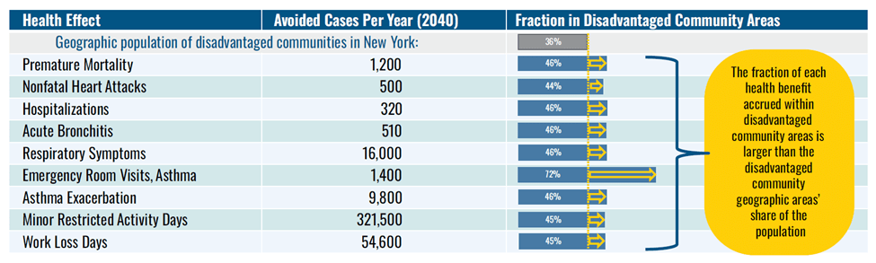
All these calculations are based on air quality impacts estimated using a methodology that is based on the premise that air quality is the driver for these health effects. I have always been uncomfortable with claims like this but haven’t found data for health impacts that I could compare to air quality observations. This article simply compares asthma and air quality data to see if there is a clear relationship.
Asthma Data
The New York State Department of Health has developed the New York State Asthma Dashboard. There are five component New York State data sets available:
- Asthma Emergency Department Visits
- Asthma Hospital Discharge Data
- Asthma Deaths and Death Rates
- Asthma Prevalence
- Asthma Data for the Medicaid Managed Care Population
Note that the health effect “Emergency room visits, asthma” parameter in the Draft Energy Plan health effects analysis and the “asthma emergency department visits” parameter in the first component measure the same thing. Documentation for the data sources notes that there are qualifications on these data. For example, people can have asthma and not go to the emergency department and asthma visits are not only related to exposure but also are related to access and quality of primary care.
The Asthma Dashboard provides county-level data for 11 indicators in the “asthma emergency department visits” component. There is an export function tab on the Main County Dashboard that I used to download a file with county-level data in the Asthma dashboard – county trend tab in AD-County Trend Data RC spreadsheet. The annual trend tab lists values for the discrete years 2017-2022. The County tab lists values for those counties that had ambient air quality monitoring stations listed in the Health Benefits Chapter Appendix Table A-3.
Ambient Air Quality Data
The New York State Department of Environmental Conservation (DEC) operates an ambient air quality monitoring system across the state and prepares annual reports. The methodology appendix in the Health Benefits chapter of the Draft Energy Plan compares the observed inhalable particulate matter (PM2.5) with their model predictions to validate their approach as shown in Table A-3 below. That analysis used data from 19 monitoring sites. This analysis will use the same sites except for the near-road monitor because they are not intended to capture average ambient concentrations.
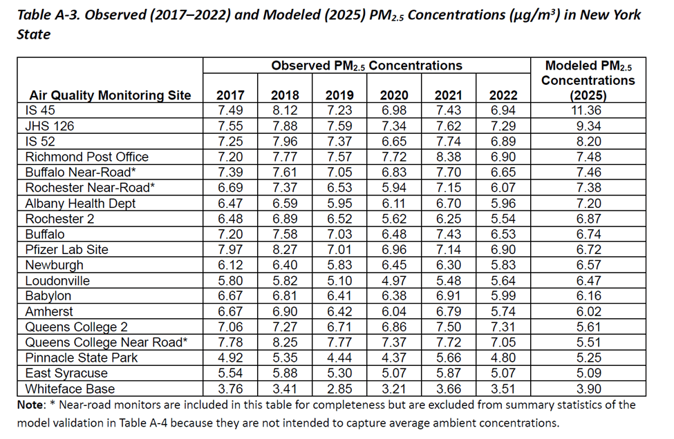
Source: Draft Energy Plan Health Impacts Analysis
Asthma and Inhalable Particulates
The presumption in the Health Impacts analysis is that higher pollution levels will result in greater asthma health effects. The purpose of this article is to simply check the data for this relationship. The data used, graphs generated and statistics calculated are available. I used EXEL to calculate correlation coefficients using the CORREL function. This coefficient ranges from -1 (perfect negative) to +1 (perfect positive); values near zero indicate little/no linear relationship between the variables. If asthma rates are related to inhalable pollution, then the coefficient should be close to +1. I also plotted the asthma health impacts against the pollution levels to see if there is an obvious relationship. The relative changes of the parameters over time should indicate if the premise is likely. Note that I have scaled the inhalable particulate concentrations so that the plots both show differences with time.

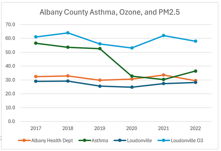
The CORREL correlation coefficient for the Albany monitor and the Total asthma emergency department visit rate per 10,000 in Albany County was 0.07 and for Loudonville it was 0.40. Note that these were the only correlation coefficients that suggested there was a positive relationship between pollution and asthma. Inhalable particulate (PM2.5) concentrations are multiplied by 5 in the graph.

The CORREL correlation coefficient for the IS-52 monitor and the Total asthma emergency department visit rate per 10,000 in the Bronx was -0.46 and -0.80 for Pfizer Lab Site Botanical Garden. Inhalable particulate (PM2.5) concentrations are multiplied by 20.

The CORREL correlation coefficient for the Amherst monitor and the Total asthma emergency department visit rate per 10,000 in Erie County was -0.62 and -0.51 for Pfizer Lab Site Botanical gar. Inhalable particulate (PM2.5) concentrations are multiplied by 10.

The CORREL correlation coefficient for the Whiteface Base monitor and the Total asthma emergency department visit rate per 10,000 in Erie County was -0.02. Inhalable particulate (PM2.5) concentrations are multiplied by 10.

The CORREL correlation coefficient for the JHS 126 monitor and the Total asthma emergency department visit rate per 10,000 in Kings County was -0.58. Inhalable particulate (PM2.5) concentrations are multiplied by 10.

The CORREL correlation coefficient for the IS 45 monitor and the Total asthma emergency department visit rate per 10,000 in Manhattan was -0.63. Inhalable particulate (PM2.5) concentrations are multiplied by 10.

The CORREL correlation coefficient for the IS 45 monitor and the Total asthma emergency department visit rate per 10,000 in Monroe County was -0.75. This relationship was the worst observed. Inhalable particulate (PM2.5) concentrations are multiplied by 10.
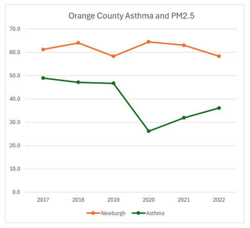
The CORREL correlation coefficient for the Newburgh monitor and the Total asthma emergency department visit rate per 10,000 in Orange County was -0.45. Inhalable particulate (PM2.5) concentrations are multiplied by 10.
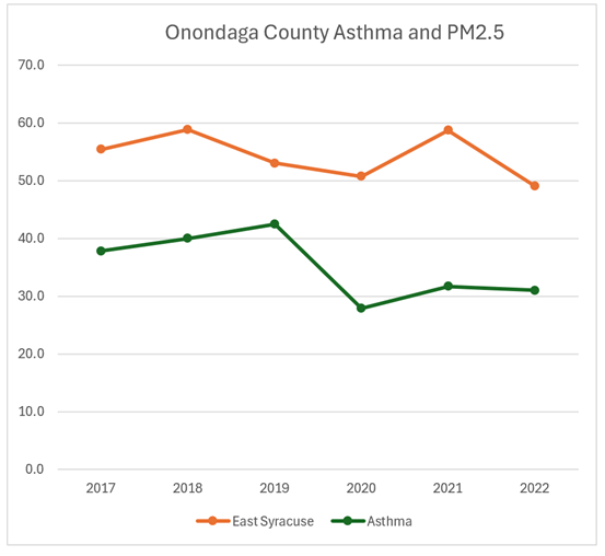
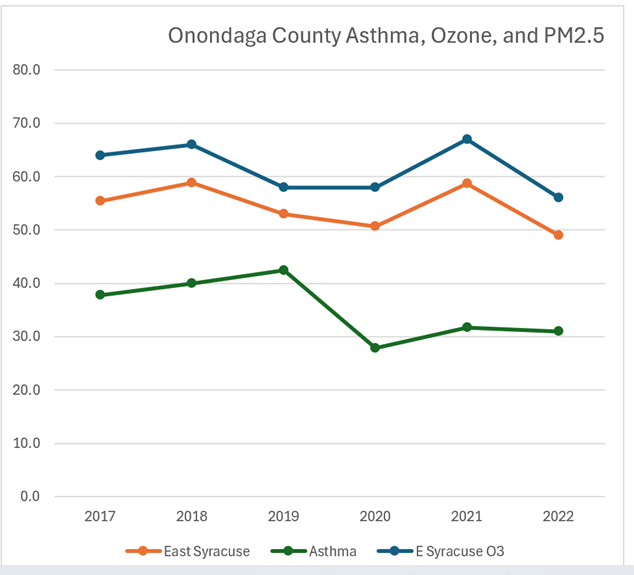
The CORREL correlation coefficient for the East Syracuse monitor and the Total asthma emergency department visit rate per 10,000 in Onondaga County was -0.45. Inhalable particulate (PM2.5) concentrations are multiplied by 10.
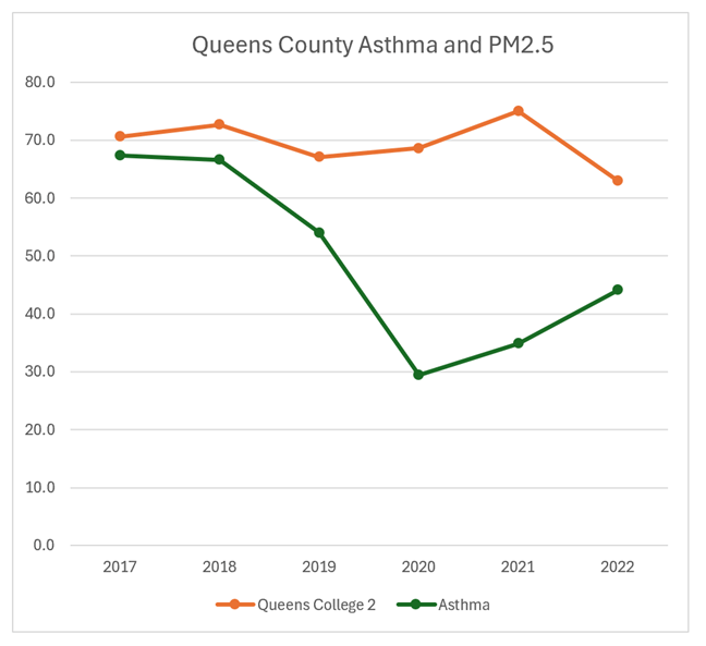
The CORREL correlation coefficient for the Queens College 2 monitor and the Total asthma emergency department visit rate per 10,000 in Queens County was -0.37. Inhalable particulate (PM2.5) concentrations are multiplied by 10.

The CORREL correlation coefficient for the Port Richmond monitor and the Total asthma emergency department visit rate per 10,000 in Richmond County was -0.00. This was the monitor with the least indication of a relationship. Inhalable particulate (PM2.5) concentrations are multiplied by 10.
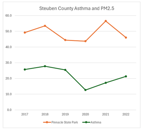
The CORREL correlation coefficient for the Pinnacle State Park monitor and the Total asthma emergency department visit rate per 10,000 in Steuben County was -0.08. Inhalable particulate (PM2.5) concentrations are multiplied by 10.
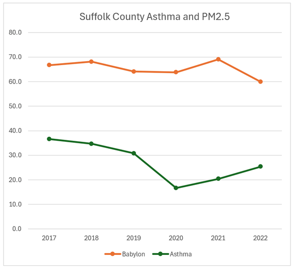
The CORREL correlation coefficient for the Babylon monitor and the Total asthma emergency department visit rate per 10,000 in Suffolk County was -0.50. Inhalable particulate (PM2.5) concentrations are multiplied by 10.
Asthma, Ozone, and Inhalable Particulates
The Health Benefits chapter calculates benefits based on impacts from inhalable particulates and ozone. The following graphs include ozone. I did not calculate the correlation coeffients. Note that there are fewer ozone monitors.
Inhalable particulate (PM2.5) concentrations are multiplied by 5 and ozone concentrations are multiplied by 1,000.
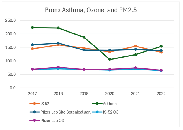
Inhalable particulate (PM2.5) concentrations are multiplied by 20 and ozone concentrations are multiplied by 1,000.
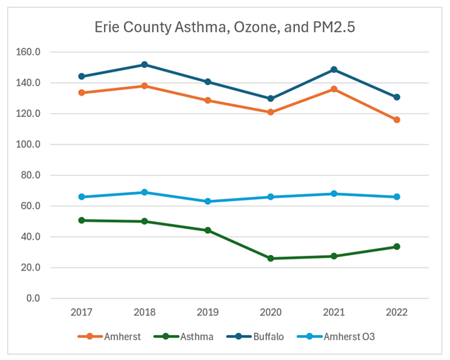
Inhalable particulate (PM2.5) concentrations are multiplied by 10 and ozone concentrations are multiplied by 1,000.

Inhalable particulate (PM2.5) concentrations are multiplied by 10 and ozone concentrations are multiplied by 1,000.

Inhalable particulate (PM2.5) concentrations are multiplied by 10 and ozone concentrations are multiplied by 1,000.
Inhalable particulate (PM2.5) concentrations are multiplied by 10 and ozone concentrations are multiplied by 1,000.

Inhalable particulate (PM2.5) concentrations are multiplied by 10 and ozone concentrations are multiplied by 1,000.
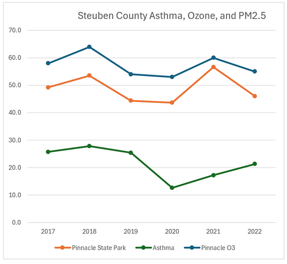
Inhalable particulate (PM2.5) concentrations are multiplied by 10 and ozone concentrations are multiplied by 1,000.

Inhalable particulate (PM2.5) concentrations are multiplied by 10 and ozone concentrations are multiplied by 1,000.
Discussion
I believe that NYSERDA has the responsibility to show that their health effect methodology is accurate. The intent of this post was to simply generate the graphs and run a simple statistic to see if there was an obvious relationship between normalized county-wide total asthma emergency department visits and air quality monitoring station measured concentrations of inhalable particulates and ozone. I did not think there would be an obvious relationship, but I was surprised that it was so bad. Only two of the sixteen comparisons suggested that there was a relationship that indicated that inhalable particulate concentrations influenced asthma emergency department visits.
In the oral comments I made on September 13, I stated that to establish credibility the modeling must prove the methodology is accurate by comparing predictions and observations over the same time period. Incredibly, the Draft Energy Plan does not do that. On page A-13 the draft states: “Because model projections were only available starting with year 2025, these results were compared against multiple years of observational data”. That is just plain wrong.
The 2017-2022 data set used was listed in their Table A-3. This is a very limited data set for validating a model. I did not bother to try to calculate more sophisticated statistics for my evaluation because the level of effort was high and the data sets so small that any result would not be robust. Nonetheless, these results set a high bar for the Draft Energy Plan health effects analysis validation study. If there is no observed relationship between observed air quality and asthma effects, then I cannot imagine a scenario where model predictions compared to observations over the same time period could possibly show that the model is working satisfactorily.
Conclusion
I intend to use the information in this post as part of my written comments on the Draft Energy Plan. I have more concerns that will make the modeling results used in the health benefits analysis even less credible. As I said in my oral comments last week, I have seen no indication that NYSERDA is going to seriously consider stakeholder input so this will likely be the extent of my written comments. When I submit my comments, I will conclusively prove that the air quality relationships that are the fundamental driver of the health benefits are wrong. The question is whether NYSERDA and, by extension the Hochul Administration, will concede that there is a problem and revise their analysis. I do not think that they will even acknowledge that I submitted a contradictory comment.
