
When I first saw a graph from a New York Times article entitled “America’s air quality worsens, ending years of gains, study says” my first thought was that the reporter must have mis-read the analysis report. However, National Bureau of Economic Research working paper 26381 “Recent Increases in Air Pollution: Evidence and Implications for Mortality” by Karen Clay and Nicholas Z. Muller (hereinafter “Clay and Muller”) from Carnegie Mellon University apparently does claim that air quality is getting worse. I am spurred to check this claim out because the last time I checked all the air quality trends were down.
Although the emphasis of my work before retirement was environmental regulatory analysis coupled with emissions reporting I have always been primarily an air quality meteorologist. My experience includes managing an ambient air quality monitoring network, modeling air quality and interpreting the monitoring and modeling results for regulatory applications. Frankly, this claim struck a nerve with me and I felt I had to respond. The opinions expressed in this post do not reflect the position of any of my previous employers or any other company I have been associated with, these comments are mine alone.
Background
The abstract for the Clay and Muller paper states:
After declining by 24.2% from 2009 to 2016, annual average fine particulate matter (PM2.5) in the United States in counties with monitors increased by 5.5% between 2016 and 2018. Increases occurred in multiple census regions and in counties that were in and out of attainment with National Ambient Air Quality Standards (NAAQS). We explore channels through which the increase may have occurred including increases in economic activity, increases in wildfires, and decreases in Clean Air Act enforcement actions. The health implications of this increase in PM2.5 between 2016 and 2018 are significant. The increase was associated with 9,700 additional premature deaths in 2018. At conventional valuations, these deaths represent damages of $89 billion.
The National Trend of PM2.5 graph attributed to the paper in the New York Times article shows an “alarming” reversal of the air quality trend. I am only going to respond to this trend claim and the discussion of possible causes. The discussion of health implications deserves a response too but that will have to wait.
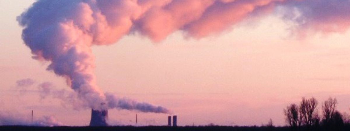
PM2.5
The EPA PM basics page describes this pollutant. PM2.5 is particulate matter with a diameter 2.5 micrometers and smaller. It is also called fine inhalable particles and the key point is that these particles are so small that they can be inhaled deeply into the lungs. Although this can clearly cause health problems there are controversies about threshold effects. The EPA reference describes the sources of PM:
These particles come in many sizes and shapes and can be made up of hundreds of different chemicals. Some are emitted directly from a source, such as construction sites, unpaved roads, fields, smokestacks or fires. Most particles form in the atmosphere as a result of complex reactions of chemicals such as sulfur dioxide and nitrogen oxides, which are pollutants emitted from power plants, industries and automobiles.
Measuring particles this small is difficult and a representative national network for monitoring PM2.5 has only been available since 2000. However, because most of these fine particles are created from sulfur dioxide and nitrogen oxides, we can use trends from those pollutants as a surrogate for expected levels of PM2.5.
EPA has trend data readily available for all the national ambient air quality standard pollutants. Also included at the website is an interactive trend report. Importantly for this post, the EPA website provides links for easy data downloads.
Clay and Muller Analysis
Clay and Muller used daily data from the EPA Air Quality Data System for all observations in the contiguous United States from 2009 to 2018. They considered not only the total PM2.5 concentration but also the three major species: ammonium nitrate, sulfate and elemental carbon. The dataset of 1.8 million daily readings was statistically processed to calculate trends not only nation-wide but also in different regions of the country.
Once they found their worrisome trend they examined three possible channels through which the recent increase may have occurred: economic activity, wild fires, and enforcement. Economic activity was studied by looking at the speciated PM2.5 data to attribute the source of pollution. Wildfire effects were determined by looking at the West, Midwest, and California regions by omitting June through September data. To estimate the effect of enforcement they used an EPA database of “actions resulting in a penalty for violations of section 113d of the Act”.
The New York Times article claims that this work shows a reversal of a decades-long trend toward cleaner air and quotes study co-author Nick Muller, a professor of economics, engineering and public policy at Carnegie Mellon as saying “After a decade or so of reductions this increase is a real about-face.”
My Analysis
In order to do this kind of analysis correctly is a big deal. Ambient air quality refers to the make-up of the air we breathe. It is affected by air pollution emissions and the meteorological conditions that affect the transport and diffusion of the material between the time it is emitted and the time we breathe it. For regulatory assessments whether the ambient concentrations comply with the National Ambient Air Quality Standards you need to consider both of those components. As you can imagine setting up an inventory of all the pollutants that affect PM2.5, developing a meteorological database to model transport and diffusion and finally running a model that not only incorporates those factors but also includes the chemistry that changes the emissions to the chemicals we breathe is a massive undertaking. Nonetheless, I think we can do something simpler to test the conclusions of the Clay and Muller paper.
Contrary to popular opinion calculating environmental trends is not as simple as you might first imagine. For example, if the number and location of monitoring stations changes over time then the trends may change because of those changes and not because of some underlying difference in emissions, economic activity or enforcement actions. As noted previously EPA analyzes and reports on air quality trends. Importantly their primary consideration is to make sure the data they report represents what is actually happening and does not include data artifacts. Another point is that because meteorological conditions affect pollution concentrations, we should expect variations in monitored values solely due to weather. In order to minimize that effect the longer the period of record for the data the better because it averages the weather impacts out.
EPA PM2.5 trend data from a representative network of stations is available from the EPA website starting in 2000 so the obvious first thing to do is to look at all the data available. The EPA Air Quality Data Summary table lists the annual nation-wide average, the year-to-year differences and the difference over the entire period of record and the difference between 2016 and 2018. These numbers corroborate the claim that PM2.5 air quality did get worse the last two years. However, the period of record air quality data in my table show that there has been a marked improvement since 2000: PM2.5 is down nearly 40%, SO2 is down 82% and NOx is down 33%. Even though there was a concentration increase the last two years, note that there were three other years when the PM2.5 concentrations failed to go down and two of them had higher increases than the last two years. Similar results are shown in the SO2 and NOx data.
Remember that ambient concentrations are a function of weather and emissions. Rather than trying to estimate the effect of emissions on concentrations by looking at the observed content it is simpler, and much more likely to be accurate, to simply look at the emissions. EPA also provides emissions trend data. The EPA Emissions Data Summary table lists annual PM2.5, SO2 and NOx emissions data in the same format as the air quality data summary table. These data include emissions from electric utilities, industry, storage, transportation, and a miscellaneous category that includes wildfires. Estimating emissions from the wide variety of sources means that there is a wide range of data quality but I assume that these values are appropriate for the purpose at hand. Note that according to these data PM2.5, SO2 and NOx emissions all went down not only over the period of record but also between 2016 and 2018.
Clay and Muller examined three possible channels through which the recent increase may have occurred: economic activity, wild fires, and enforcement. In their analysis of economic activity, they conclude that “The chemical composition of particulates point to increased use of natural gas and to vehicle miles traveled as likely contributors to the increase in PM2.5”. Because their analysis did not consider the potential effect of weather on transport and diffusion and because the emissions trend was down even while the ambient concentrations went up, I disagree with that conclusion. With regards to wildfires, Clay and Muller conclude that wild fires “may account for some of the observed increase in PM2.5 from 2016 to 2018, but not for the general pattern of decline and then reversal. I think that their methodology is too coarse to pick up a wildfire signal. Even though the paper doesn’t find a link between enforcement actions and the PM2.5 trend they conclude “The decline in enforcement actions, however, is concerning in light of the increases in air pollution in both attainment and nonattainment counties after 2016.” In the first place in my experience the majority of enforcement actions have little to do with emissions levels and mostly to do with reporting inconsistencies but I believe it is much more likely that enforcement actions are going down because the regulatory agencies are doing a good job. That is to be applauded not to be a matter of concern.
Conclusion
I am not impressed with the methodology used in this paper. Number crunching over a million records to determine a trend has risks that professors of economics apparently did not recognize. Ambient levels of pollution are affected not only be emissions and the factors that they examined but also by meteorology and monitoring system issues. The inter-annual changes noted were more likely simply due to meteorology as any change in emissions and precursor emissions that the Clay and Muller paper claimed.
I am trying to give the authors the benefit of the doubt that they did not know any better but I am frustrated that they apparently did not bother to seek the advice of any air quality meteorologist or air pollution monitoring scientist. I am confident that anyone of those experts would have said the longer the trend the better and don’t expect a perfectly decreasing ambient air quality trend even when the emissions are decreasing over time. Trying to tease out a rationale for an air quality trend change likely less than the variability of the measurements due to weather is an abuse of air quality trends. Now that these results have shown up in the New York Times many people have been mislead.
