PM2.5 Health Impacts in New York City

In the last several days I have been drafting a review of  the PEAK Coalition report entitled: “Dirty Energy, Big Money” and today I was working on the air quality health impacts section.  I also noticed today that the usual suspects are claiming links between air pollution and Covid-19 susceptibility. In this post I will explain how I could be convinced that the reports underlying presumption that inhalable particulates have dire health impacts is correct.

I am a retired electric utility meteorologist with nearly 40 years-experience analyzing the effects of air quality and meteorology on electric operations.  I have been reviewed health impact claims throughout my career.  This background served me well preparing this post.  The opinions expressed in this post do not reflect the position of any of my previous employers or any other company I have been associated with, these comments are mine alone.

Background

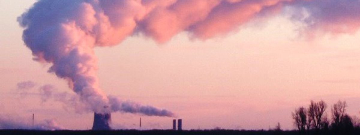
Health impacts associated with inhalable particulates, also known as PM2.5 because it refers to airborne particles with a diameter of 2.5 micrometers or less, turn out to be the primary rationale for all the recent EPA air quality emission reductions cost-benefit analyses.  For example, EPA’s air toxics emission limits were cost effective not because of direct impacts of mercury and other heavy metals but because the control systems for those pollutants would have decreased PM2.5 concentrations and led to alleged health improvements.

Steve Milloy’s Scare Pollution: Why and How to Fix the EPA explains the problems with those health impact claims.  Milloy points out that no one has proven a biological explanation why the inhaled particles will cause fatal inflammation.  The alleged relationship is based on epidemiological statistical evaluation of air quality and health impact data.  The basic problem is that there are many confounding factors known to cause the observed health impacts and trying to tease air quality impacts out of the mix is difficult to prove.

It gets worse.  The studies that are the basis for the alleged air quality health impacts were at relatively high ambient concentrations.  Make no mistake that air pollution can be a very bad thing but the levels of pollution in the United States that clearly caused health impacts occurred many years ago and included a mix of pollutants not found anywhere in this country today.  It gets worse because the dose-health impact relationship is being extrapolated using the linear no-threshold model which has been used to estimate the dose response for radiation health impacts.  The concept is that there is no threshold below which there is no effect.  However, in my opinion and others, extrapolating measurements and responses at high levels down to levels near the level of detection is an unwarranted presumption.  Nonetheless, advocates for ever lower air quality improvements routinely claim health impacts behave the same way.

Public Health Impacts

The primary public health reference in the PEAK Coalition report I am reviewing was the New York City Department of Health and Mental Hygiene’s (DOHMH) Air Pollution and the Health of New Yorkers report.  The PEAK coalition description of air quality public health impacts quotes the conclusion from the DOHMOH report: “Each year, PM2.5 pollution in [New York City] causes more than 3,000 deaths, 2,000 hospital admissions for lung and heart conditions, and approximately 6,000 emergency department visits for asthma in children and adults.”  These conclusions are for average air pollution levels in New York City as a whole over the period 2005-2007.

The DOHMOH report specified four scenarios for comparisons (DOHMOH Figure 4) and calculated health events that it attributed to citywide PM2.5 (DOHMOH Table 5).  Based on their results the report notes that:

Even a feasible, modest reduction (10%) in PM2.5 concentrations could prevent more than 300 premature deaths, 200 hospital admissions and 600 emergency department visits. Achieving the PlaNYC goal of “cleanest air of any big city” would result in even more substantial public health benefits.

It is important to note how air quality has improved since the time of this analysis.  The NYS DEC air quality monitoring system has operated a PM2.5 monitor at the Botanical Garden in New York city since 1999 so I compared the data from that site for the same period as this analysis relative to the most recent data available (Data from Figure 4. Baseline annual average PM2.5 levels in New York City). The Botanical Garden site had an annual average PM2.5 level of 13 µg/m3 for the same period as the report’s 13.9 µg/m3 “current conditions” city-wide average (my estimate based on their graph).  The important thing to note is that the latest available average (2016-2018) for a comparable three-year average at the Botanical Garden is 8.1 µg/m3 which represents a 38% decrease.  That is substantially lower than the PlaNYC goal of “cleanest air of any big city” scenario at an estimated city-wide average of 10.9 µg/m3.

Note that in DOHMOH Table 5 the annual health events for the 10% reduction and “cleanest” city scenarios are shown as changes not as the total number of events listed for the current levels scenario.  My modified table (Modified Table 5. Annual health events attributable to citywide PM2 5 level) converts those estimates to totals so that the numbers are directly comparable.  I excluded the confidence interval information because I don’t know how to convert them in this instance.

I confirmed that the DOHMOH analysis used a linear no-threshold health impact analysis and used their relationship to estimate the effect of the observed air quality reduction. I tested the linear hypothesis by scaling the “current level” scenario number of events to the proportion of the PM 2.5 concentrations (the last row in the table) for the “current level” and the other two scenarios.  My estimated health impacts were all within 1% which proves that the DOHMOH analysis relied on a linear no-threshold approach.  As a result, that means that I could estimate the health impact improvements due to the observed reductions in PM2.5 as shown in the last three columns in the modified table.  I estimate that the observed reduction in PM2.5 concentrations prevented nearly 1,300 premature deaths, 800 hospital admissions and 2400 emergency department visits.

Conclusion

In order to convince me that the PM2.5 health impacts claimed by MOHDOH and many others are correct I need to see confirmation with observed data.  The DOHMOH report claims that in 2005-2007 that PM2.5 concentrations led to, for example, 3,200 premature mortality events.  I have no idea how that number compares to observed values for this parameter or the others included.  I estimate that for the observed reductions in measured PM2.5 the number of premature mortality events would be reduced 1,296 events down to 1,904 events.

The first question for the health experts is whether the change from 2005-2007 to 2016-2018 of 1,296 events could be observed against natural variations or is that number within the normally expected variation.  If not then my hope for verification is not possible but more importantly it also means that the gloom and doom stories of significant health impacts are base on nothing more than insignificant statistical noise that is not really observable.  If those data are greater than expected natural variation, then it would be possible to document improvements in these alleged health impacts due to the 38% decrease in PM2.5.  If that is the case, then I stand corrected.

Here is the thing though.  The percentage of people with asthma in the United States from 2001 to 2018 is not showing a decrease at the same time ambient levels of all air pollutants are going down substantially.  While correlation does not necessarily mean causation, no correlation with a purported cause indicates a bet on a dead horse.  Therefore, I am not holding my breath that the data will show the purported benefits.

Encouraging COVID-19 Information for New York

Doctors have warned that air pollution increases the risks of dying from COVID-19.  This post compares air pollution levels in Italy with the highest European COV-19 mortality with New York State where the largest number of COVID-19 cases have occurred in the US.  I am sure the general impression is that New York City air quality is so bad that, if this relationship is true, that similar mortality rates are inevitable but I will show that is not the case.

Background

In an interview Dr. Sucharit Bhakdi, a German microbiology specialist, explains that the reason for the apparent global different mortality rates for COVID-19 may be because of different local situations.  He points out Northern Italy and China both have air pollution problems as well as high mortality rates.  Consistent with others he suggests that the lungs of individuals in those areas have been chronically injured over decades and this influences the mortality rates.

I compared Italian data with New York data that I had on hand.  Italian air quality data are available at the European Environment Agency Italy air pollution country fact sheet website.  Air quality data from New York’s monitoring network are available at the New York State Department of Environmental Conservation air quality monitoring website, in their annual reports, and there is an Environmental Protection Agency website that also has the data.  Particulate Matter 2.5 (PM2.5 measures particles that are generally 2.5 micrometers or smaller), Particulate 10 (PM10 measures particles that are generally 10 micrometers or smaller), nitrogen dioxide (NO2) and ozone are measured in both jurisdictions.  Unfortunately. the readily available summary data for PM10 and ozone data are not directly comparable because the air quality standards are different.  New York has only a few monitors for NO2.   The pollutant of most concern for health impacts is PM 2.5 because these particles are small enough to get inhaled into the lung.  There are seven monitoring sites within New York State with directly comparable PM2.5 data and that have reported data since 1999.  The only issue is that those data are not readily available so I have manually extracted these data from annual reports over the years.

Comparison

The Comparison of Italian Average and Selected New York State Air Monitors Annual Average Air Quality Data table includes Italian and New York PM2.5 annual average measurements that are encouraging.  Italian data are downloadable in three categories: Traffic which represents the highest expected levels, suburban/urban background which I assume represents ambient conditions for most people, and rural background which should represent atmospheric concentrations without Italian impacts.  The New York data are listed for the Botanical Garden station in New York City, three Upstate cities, a monitoring location on Long Island that is downwind of New York City and two rural background stations.

The Italian traffic impacts site had a PM2.5 annual average of 18.3 µg/m3, the suburban/urban background was 17.2 µg/m3and the rural background was 16.1 µg/m3.  The good news is that the monitoring location with the highest observed annual PM2.5 concentrations was at the Botanical Garden monitor in New York City was 8.0 µg/m3 which was less than half the rural Italian average background.  Note that in the most recent year there were a total of 23 PM2.5 air monitors operating in New York City.  In 2018 the Botanical Garden monitor had an annual average greater than or equal to all but four of the monitors.  The highest annual average was 10.4 µg/m3 still well under the Italian rural background.  The important thing to note is that all of New York PM2.5 annual averages are smaller than the lowest Italian traffic and suburban/urban background sites since 1999 and the rural background site averages since 2002.  There is no question that New York State air quality is substantively better than Italy for PM2.5.

I also list the nitrogen dioxide data.  New York NO2 air quality levels are only marginally better than Italy.   It is instructive to compare the two pollutants.  NO2 primarily gets in the air from the burning of fuel. NO2 forms from emissions from cars, trucks and buses, power plants, and off-road equipment.  Most small particles form in the atmosphere as a result of complex reactions of chemicals such as sulfur dioxide and nitrogen oxides, which are pollutants emitted from power plants, industries and automobiles.  I suspect the difference between New York and Italian air quality reflects the success of the EPA and New York State air pollution control efforts since 1990.  Since 1999 New York power plant sulfur dioxide emissions are down 99% and nitrogen oxides emissions are down 92%.  Coupled with concurrent reductions from industrial sources this has been a primary factor for the PM2.5 reductions.  I guess that Italian sources have not reduced their emissions as much.  On the other hand, New York continues to struggle with the ozone ambient air quality standards in part because nitrogen oxides emissions from the transportation sector have not come down nearly as much.  This would explain why the Italian and New York NO2 data don’t differ as much.

Conclusion

I think there is a general perception that New York City air quality is poor.  The fact is that while there are still some overall New York issues, the pollution levels have improved significantly.  The good news is that if the hypothesis that the COVID-19 mortality rate is related to chronic air pollution levels and that PM2.5 is a good surrogate for that pollution, then these data suggest that factor will not have as much of an effect in New York State in general and New York City either.  The PM2.5 concentrations are significantly lower than either Italy and, I would presume, China too.

Abuse of Air Quality Trends Data

When I first saw a graph from a New York Times article entitled “America’s air quality worsens, ending years of gains, study says” my first thought was that the reporter must have mis-read the analysis report. However, National Bureau of Economic Research working paper 26381 “Recent Increases in Air Pollution: Evidence and Implications for Mortality” by Karen Clay and Nicholas Z. Muller (hereinafter “Clay and Muller”) from Carnegie Mellon University apparently does claim that air quality is getting worse. I am spurred to check this claim out because the last time I checked all the air quality trends were down.

Although the emphasis of my work before retirement was environmental regulatory analysis coupled with emissions reporting I have always been primarily an air quality meteorologist. My experience includes managing an ambient air quality monitoring network, modeling air quality and interpreting the monitoring and modeling results for regulatory applications. Frankly, this claim struck a nerve with me and I felt I had to respond. The opinions expressed in this post do not reflect the position of any of my previous employers or any other company I have been associated with, these comments are mine alone.

Background
The abstract for the Clay and Muller paper states:

After declining by 24.2% from 2009 to 2016, annual average fine particulate matter (PM2.5) in the United States in counties with monitors increased by 5.5% between 2016 and 2018. Increases occurred in multiple census regions and in counties that were in and out of attainment with National Ambient Air Quality Standards (NAAQS). We explore channels through which the increase may have occurred including increases in economic activity, increases in wildfires, and decreases in Clean Air Act enforcement actions. The health implications of this increase in PM2.5 between 2016 and 2018 are significant. The increase was associated with 9,700 additional premature deaths in 2018. At conventional valuations, these deaths represent damages of $89 billion.

The National Trend of PM2.5 graph attributed to the paper in the New York Times article shows an “alarming” reversal of the air quality trend. I am only going to respond to this trend claim and the discussion of possible causes. The discussion of health implications deserves a response too but that will have to wait.

PM2.5

The EPA PM basics page describes this pollutant.  PM2.5 is particulate matter with a diameter 2.5 micrometers and smaller.  It is also called fine inhalable particles and the key point is that these particles are so small that they can be inhaled deeply into the lungs.  Although this can clearly cause health problems there are controversies about threshold effects.  The EPA reference describes the sources of PM:

These particles come in many sizes and shapes and can be made up of hundreds of different chemicals.  Some are emitted directly from a source, such as construction sites, unpaved roads, fields, smokestacks or fires.  Most particles form in the atmosphere as a result of complex reactions of chemicals such as sulfur dioxide and nitrogen oxides, which are pollutants emitted from power plants, industries and automobiles.

Measuring particles this small is difficult and a representative national network for monitoring PM2.5 has only been available since 2000.  However, because most of these fine particles are created from sulfur dioxide and nitrogen oxides, we can use trends from those pollutants as a surrogate for expected levels of PM2.5.

EPA has trend data readily available for all the national ambient air quality standard pollutants.  Also included at the website is an interactive trend report.  Importantly for this post, the EPA website provides links for easy data downloads.

Clay and Muller Analysis

Clay and Muller used daily data from the EPA Air Quality Data System for all observations in the contiguous United States from 2009 to 2018.  They considered not only the total PM2.5 concentration but also the three major species: ammonium nitrate, sulfate and elemental carbon.  The dataset of 1.8 million daily readings was statistically processed to calculate trends not only nation-wide but also in different regions of the country.

Once they found their worrisome trend they examined three possible channels through which the recent increase may have occurred: economic activity, wild fires, and enforcement.  Economic activity was studied by looking at the speciated PM2.5 data to attribute the source of pollution.  Wildfire effects were determined by looking at the West, Midwest, and California regions by omitting June through September data.  To estimate the effect of enforcement they used an EPA database of “actions resulting in a penalty for violations of section 113d of the Act”.

The New York Times article claims that this work shows a reversal of a decades-long trend toward cleaner air and quotes study co-author Nick Muller, a professor of economics, engineering and public policy at Carnegie Mellon as saying “After a decade or so of reductions this increase is a real about-face.”

My Analysis

In order to do this kind of analysis correctly is a big deal.  Ambient air quality refers to the make-up of the air we breathe.  It is affected by air pollution emissions and the meteorological conditions that affect the transport and diffusion of the material between the time it is emitted and the time we breathe it.  For regulatory assessments whether the ambient concentrations comply with the National Ambient Air Quality Standards you need to consider both of those components.  As you can imagine setting up an inventory of all the pollutants that affect PM2.5, developing a meteorological database to model transport and diffusion and finally running a model that not only incorporates those factors but also includes the chemistry that changes the emissions to the chemicals we breathe is a massive undertaking.  Nonetheless, I think we can do something simpler to test the conclusions of the Clay and Muller paper.

Contrary to popular opinion calculating environmental trends is not as simple as you might first imagine.  For example, if the number and location of monitoring stations changes over time then the trends may change because of those changes and not because of some underlying difference in emissions, economic activity or enforcement actions.  As noted previously EPA analyzes and reports on air quality trends.  Importantly their primary consideration is to make sure the data they report represents what is actually happening and does not include data artifacts.  Another point is that because meteorological conditions affect pollution concentrations, we should expect variations in monitored values solely due to weather.  In order to minimize that effect the longer the period of record for the data the better because it averages the weather impacts out.

EPA PM2.5 trend data from a representative network of stations is available from the EPA website starting in 2000 so the obvious first thing to do is to look at all the data available.  The EPA Air Quality Data Summary table lists the annual nation-wide average, the year-to-year differences and the difference over the entire period of record and the difference between 2016 and 2018.  These numbers corroborate the claim that PM2.5 air quality did get worse the last two years.  However, the period of record air quality data in my table show that there has been a marked improvement since 2000:  PM2.5 is down nearly 40%, SO2 is down 82% and NOx is down 33%.  Even though there was a concentration increase the last two years, note that there were three other years when the PM2.5 concentrations failed to go down and two of them had higher increases than the last two years. Similar results are shown in the SO2 and NOx data.

Remember that ambient concentrations are a function of weather and emissions.  Rather than trying to estimate the effect of emissions on concentrations by looking at the observed content it is simpler, and much more likely to be accurate, to simply look at the emissions.  EPA also provides emissions trend data.  The EPA Emissions Data Summary table lists annual PM2.5, SO2 and NOx emissions data in the same format as the air quality data summary table.  These data include emissions from electric utilities, industry, storage, transportation, and a miscellaneous category that includes wildfires.  Estimating emissions from the wide variety of sources means that there is a wide range of data quality but I assume that these values are appropriate for the purpose at hand.  Note that according to these data PM2.5, SO2 and NOx emissions all went down not only over the period of record but also between 2016 and 2018.

Clay and Muller examined three possible channels through which the recent increase may have occurred: economic activity, wild fires, and enforcement.  In their analysis of economic activity, they conclude that “The chemical composition of particulates point to increased use of natural gas and to vehicle miles traveled as likely contributors to the increase in PM2.5”.  Because their analysis did not consider the potential effect of weather on transport and diffusion and because the emissions trend was down even while the ambient concentrations went up, I disagree with that conclusion.  With regards to wildfires, Clay and Muller conclude that wild fires “may account for some of the observed increase in PM2.5 from 2016 to 2018, but not for the general pattern of decline and then reversal.  I think that their methodology is too coarse to pick up a wildfire signal.  Even though the paper doesn’t find a link between enforcement actions and the PM2.5 trend they conclude “The decline in enforcement actions, however, is concerning in light of the increases in air pollution in both attainment and nonattainment counties after 2016.”  In the first place in my experience the majority of enforcement actions have little to do with emissions levels and mostly to do with reporting inconsistencies but I believe it is much more likely that enforcement actions are going down because the regulatory agencies are doing a good job.  That is to be applauded not to be a matter of concern.

Conclusion

I am not impressed with the methodology used in this paper.  Number crunching over a million records to determine a trend has risks that professors of economics apparently did not recognize.  Ambient levels of pollution are affected not only be emissions and the factors that they examined but also by meteorology and monitoring system issues.  The inter-annual changes noted were more likely simply due to meteorology as any change in emissions and precursor emissions that the Clay and Muller paper claimed.

I am trying to give the authors the benefit of the doubt that they did not know any better but I am frustrated that they apparently did not bother to seek the advice of any air quality meteorologist or air pollution monitoring scientist.  I am confident that anyone of those experts would have said the longer the trend the better and don’t expect a perfectly decreasing ambient air quality trend even when the emissions are decreasing over time.  Trying to tease out a rationale for an air quality trend change likely less than the variability of the measurements due to weather is an abuse of air quality trends.  Now that these results have shown up in the New York Times many people have been mislead.

New York City Energy Storage Peaking Turbine Replacement

The biggest air quality issue in New York State is compliance with the National Ambient Air Quality Standard for Ozone. In order to meet that limit the New York State of Department of Environmental Conservation (DEC) proposed regulations earlier this year to lower allowable nitrogen oxide (NOx) emissions from simple cycle and regenerative combustion turbines during the ozone season. The problem is that these turbines are needed to keep the lights on during periods when needed most so replacement is not very simple as I explained in an earlier post.

This post describes the State’s evaluation of the politically correct alternative, energy storage, to provide the power generated by these turbines. This post addresses the report findings for turbines that could be directly replaced by energy storage. I want to emphasize that the following represents my opinion and not the opinion of any of my previous employers or any other company with which I have been associated. I have been following the operational implications of these turbines and their effect on ozone for over 20 years.

Background

The evaluation of using energy storage to replace these peaking units is part of the New York State Energy Storage Roadmap announced by Governor Cuomo in June 2018. As part of that effort the Department of Public Service (DPS) established an Energy Storage Deployment Program. On July 1, 2019, Energy Storage Deployment Program Report – Unit by Unit Peaker Study was submitted to the docket for Case 18‐E‐0130 – In the Matter of Energy Storage Deployment Program. DPS staff, working with New York State Energy Research and Development Authority (NYSERDA), Long Island Power Authority (LIPA), New York Independent System Operator (NYISO), NY Department of Environmental Conservation (DEC), Con Edison, and consulting firm Energy and Environmental Economics, Inc. (E3) prepared the report. The DPS December 12, 2018 Order Establishing Energy Storage Goal and Deployment Policy directed them to develop a unit‐by‐unit operational and emission profile study and methodology to determine which downstate peaking power plant generating units are potential candidates for repowering or replacement. My previous post describes these peaking turbines and more detail on the rationale for replacement so I will not repeat that material here.

The December 2018 DPS Energy Storage Goal and Deployment Policy specified what was to be included in the analysis. It was to “include a series of reliability and operational assessment studies looking at the equivalent level of ‘clean resources’ that could provide the same level of reliability as the existing peaker units. Hybridization and repowering with energy storage, as well as replacement with stand-alone energy storage, should be explicitly examined, according to the Roadmap.”

According to the description in Energy Storage Deployment Program Report – Unit by Unit Peaker Study:

The analysis relies on historical 2013 hourly operational and emissions data for the approximately 4,500 MW of affected peaking units across the state (almost entirely concentrated in New York City, Long Island, and the Lower Hudson Valley) to examine the technical feasibility of energy storage or energy storage paired with solar providing equivalent historical generation of the peaking units. Peaker operational and emissions data from 2013 was chosen because this reflects the peak NYISO demand year, and the correspondingly high levels of peaker operation which occurred in July 2013. This served as a proxy for representing peak‐level system operations, although theoretical peak system operations may impose incremental needs beyond those of 2013. The study did not consider system changes after 2013 that may impact how conventional peaking units and energy storage resources operate in the future, such as retirements of existing units, changes in the overall levels and patterns of demand, new transmission solutions, and/or the addition of more intermittent, renewable energy.

Analysis

I am not a fan of the approach used in this analysis because I think it gives some mis-leading unit specific information. In the first place they considered all turbines as candidates not understanding that the primary purpose of some turbines is not to provide power during high load demand periods. They wasted effort considering the Jamestown Public Utilities turbine in Western New York that runs on the order of half the time. Peaking turbines are defined as units with an “average annual capacity factor of 10.0 percent or less over the past three years”. In addition there are turbines at steam boiler facilities that are necessary for “black start” situations when there is a blackout and the power necessary to start up the boiler is unavailable from the grid. Because that is a very rare instance the units are also run to provide power for peak power periods. In my opinion it would not be cost effective to dedicate energy storage for this application. You could not use it for peak loads because you never know when the grid power won’t be available. In conclusion the report considered units that should not have been included.

According to Table A-1 in the report, there are 3,780 MW of peaking turbines in New York. The report concludes that “Overall, at least 275 MW of peaking units, or around six percent of the total rated capacity of the fleet, are found to be potential candidates for replacement with 6‐hour energy storage sized to the maximum 2013 output of each peaking unit.” That means that a 6-hr energy storage system would be able to replace 7% of the existing peaking turbine capacity. The report goes on to say that “This number increases to over 500 MW when using 8‐hour duration storage”, but that only increases the replacement of existing capacity to 13%.

I don’t disagree with their conclusion that “Energy storage or a combination of energy storage and solar can contribute towards meeting NOx limits for a large number of units”. However there is a long way between “can contribute” and “will actually be an option used”. This is a preliminary scoping study. It notes that the “minimum size storage required to meet the NOx requirements can vary between units of the same facility” but does not recognize that the variation between sister units at a facility does not mean that one unit is more of a candidate than another.  The reality is that affected sources will adopt a facility‐wide strategy to meet the NOx limits and those strategies were not examined in this report.

There are other issues as noted in the Conclusion and Recommendations for Further Study. They note that “A more detailed analysis will be needed to understand the reliability impacts of specific unit replacements, especially as loads and resources change with greater electrification of transport and buildings and higher penetrations of renewables.” Many of these peaking units are in load pockets and changes in the load will drive whether energy storage is viable.

Costs

The report states that “A more detailed and thorough benefit‐cost analysis would need to be performed to understand the true economic viability of the replacement and/or hybridization options presented in this analysis.” Therein lies the biggest issue of energy storage – the cost. For those of us outside of Albany who care about costs a recently released report from the National Renewable Energy Lab (NREL): “2018 U.S. Utility-Scale Photovoltaics-Plus-Energy Storage System Cost Benchmark” provides information that can be used to estimate the costs of the energy storage option.

The NREL study lists costs for durations up to four-hours but the DPS report also includes six-hour and eight-hour durations. Table 3 in the NREL document, Detailed Cost Breakdown for a 60-MW U.S. Li-ion Standalone Storage System with Durations of 0.5–4 Hours, provides the information necessary to extend their projections to those different durations. I fit a linear regression model to describe the relationship between the specific costs and energy storage duration from the NREL table. I use Statgraphics Centurion software from StatPoint Technologies, Inc. to do my statistical analyses because it enables the user to choose the best relationship from 27 different linear regression equations. In this evaluation, in every instance, the reciprocal-X model (Y = a + b/X) statistic was the best choice and every regression had an R-squared coefficient great than 99.9% which indicates a strong relationship and suggests that these estimates are good enough for this analysis.

The NREL analysis includes all the costs for a greenfield energy storage project so I calculated values of retrofit potential costs that exclude the land acquisition costs. I estimate the installed cost for energy to be $343/kWh for an eight-hour battery system, $355/kWh for a six-hour battery system, and $380/kWh for a four-hour battery system.

The table NYC Energy Storage Peaker Replacement Summary lists data from the DPS study and calculated values. Table E1 in the DPS report lists the total nameplate capacity (MW) of peaking units that can potentially be fully replaced with storage to meet the 2025 NOx limits at 100% sizing to each unit’s 2013 peak generation. Note that I did not include the upstate turbine included in the DPS report in this analysis because it is not a peaking turbine. There are 36 MW of peaking unit capacity in New York City and Long Island that can be replaced with four hours of storage, 229 MW that can be replaced with six hours of storage, and 463 MW with eight hours of storage for a total of 728 MW. This is 18% of the 2013 peak load in New York City and on Long Island. Table A estimates the replacement cost estimate using the NREL report numbers and shows that replacing 18% of the load with Li-ion battery storage would cost $1.8 billion.

The cost per ton removed further demonstrates the staggering cost implications. I could not figure out which particular units were candidates for replacement because my analysis of Table B-1 did not result in the same number of units in each category. As a result I could not calculate the unit-specific cost per ton removed. Instead I just used the total emissions from all the sources the report’s Table 3: Peaking Units 2013 Operational Data. Table B shows the costs if all the emissions from all the peaking units came only from the 728 MW that can be replaced by energy storage. The cost to remove a ton of NOx is over $900,000 per ton and cost to remove a ton of CO2 is over $1,000 per ton. In order to put those numbers in perspective consider that the social cost of carbon (the alleged societal cost per ton of CO2 emitted) is currently around $50 by the Obama administration method and less than $5 by the Trump administration.

Conclusion

The report concludes “Overall, the findings suggest that there is an opportunity to consider replacing or hybridizing a substantial portion of the peaking units subject to DEC’s proposed NOx rule with a fleet of storage resources paired with solar. Such an outcome would potentially deliver significant environmental benefits, advance the state’s carbon reduction and clean energy goals, as well as benefit historically disadvantaged populations and communities such as environmental justice areas in line with the goals of the Climate Leadership and Community Protection Act.” However these results show that the cost of energy storage replacement is at least an order of magnitude greater than the cost of carbon’s impacts so this opportunity is not a cost-effective way to advance the state’s carbon reduction and clean energy goals.

New York Peaking Turbines


On February 28, 2019 the New York State of Department of Environmental Conservation (DEC) proposed regulations to lower allowable nitrogen oxide (NOx) emissions from simple cycle and regenerative combustion turbines during the ozone season. On the face of it this should be a relatively simple air quality issue but it is complicated by Governor Cuomo’s clean energy agenda. I am motivated to write this post on air quality regulation and energy policy because the majority of what has been said so far about this regulation fails to discuss the complexities of the issue and misses the point of the regulations.

This post describes an open regulatory issue and I want to emphasize that the following represents my opinion and not the opinion of any of my previous employers or any other company with which I have been associated. Ozone pollution is currently New York State’s most difficult air quality issue and I have been following the particular aspect of these turbines and their effect on ozone for over 20 years. I will try to show in this post the background of the problem and how this regulation is embroiled in energy policy implications that are complicating the issue considerably.

Background

The proposed regulation covers simple cycle and regenerative combustion turbines but I am going to focus on just simple cycle turbines in New York City which make up the majority of the turbines in question. In the early 70’s Consolidated Edison was an integrated utility and responsible for generating and distributing electricity to New York City. Their generation planners developed a fleet of baseload, intermediate and peaking generating plants to provide power for the expected demand. (If you are unfamiliar with this concept I recommend the Generation Planning 101 section at this link).

Keep in mind that New York City requires massive amounts of power and there are geographical limitations as to how much can be imported in so the whole metropolitan area is a load pocket.   Moreover there were areas in the City that had their own load issues, i.e. they are in load pockets within the City-wide load pocket. In order to provide peaking power for the City and those areas Con Ed developed four combustion turbine facilities that use simple cycle turbines: Astoria (558 MW current nameplate capacity), Gowanus (640 MW), Narrows (352 MW) and Ravenswood (375.3 MW). According to the NYISO “Gold Book” in 2017 the net energy generated from all four facilities was 212.2 GWh with an overall capacity factor of 1.3% as shown in New York City Simple Cycle Peaking Turbines Summary.

New York City Simple Cycle Peaking Turbines Summary
  Number of Name Plate 2017 Net Energy Capacity
Facilities Turbines (MW) GWh Factor
Astoria 12 558.0 103.2 2.1%
Gowanus 32 640.0 31.9 0.6%
Narrows 16 352.0 56.6 1.8%
Ravenswood 10 375.3 20.5 0.6%
Total 70 1,925.3 212.2 1.3%

The units at these facilities are known as peaking turbines for a reason. They only run when power is really needed. For New York City this is primarily during the summer when load peaks due to air conditioning load. When Consolidated Edison was responsible for electric system reliability they had a fuel and generating mix that addressed peak load using these relatively cheap to install and operate turbines. Simple cycle turbines are basically jet engines hooked up to an electrical generator. In order for these sources to be profitable they have to recover all their operating and maintenance costs for the year during those peak periods. Part of the reason costs go up so much when energy demand is high is because of this effect.


While appropriate at the time they are ready for replacement. The turbines at these four facilities are approaching 50 years old, they are inefficient inasmuch as they burn more fuel than a new turbine to produce the same amount as power, and they are dirty, that is to say their emission rates are much higher than a modern turbine.


However, New York State de-regulated the electric sector at the turn of the century. As part of that process, Consolidated Edison sold most of their generating facilities and, in order to encourage competition, the in-city fossil generation assets were sold to three different companies. In the simpler time before de-regulation, DEC would have promulgated a phase-out rule and Consolidated Edison would have proposed replacement power generating facilities and received cost recovery from the NYS Department of Public Service in a rate case because of the obvious need.   Today’s owners have no such assurances. Instead they have to rely on the market to recover their investment costs. As a result energy policy is a major concern.


Ozone Air Quality Issue

As noted previously, ozone is New York State’s most difficult are quality problem. Despite years of progress ozone stubbornly fluctuates around the current National Ambient Air Quality Standard (NAAQS) limit that protects human health. It is important to keep in mind that the limit has changed over time so there has been progress but reaching the current limit has proven difficult. Ground-level ozone is not directly emitted into the atmosphere. Instead it is created in a complex photo-chemical reaction (it needs sunlight) from oxides of nitrogen (NOX) and volatile organic compounds (VOC). It is difficult to control in New York City because there are two pollutants, the reaction that creates ozone takes time so wind transport is an issue and transport in the complicated wind regimes along the Atlantic and Long Island Sound coastlines is difficult to simulate.


Ozone reaches unhealthy levels on hot sunny days and therein lies the rub. On hot sunny days people want air conditioning and as a result those are the days of peak load. That means that the peaking turbines usually run on those days most conducive to ozone formation. On those days reductions at all sources of NOX and VOC have been considered to control ozone. Because NOX is emitted from all combustion sources and VOCs are emitted from most things that have an odor there are all kinds of sources that affect ozone concentrations. Peaking turbines are one of the last large sources and I believe need to be controlled. As a side note however, I don’t think that when they are controlled that ozone compliance will be attained but it is progress and their time has come.

Electric Sector Energy Policy

If this were only an air quality issue the New York State Department of Environmental Conservation (DEC) would have simply promulgated a rule that requires phase out over time a long time ago. Unfortunately, there are energy policy ramifications, because while they are dirty, they also are necessary to provide power during peak periods. DEC wants to keep the lights on so they have not proposed such a rule until this time. During the development of the regulation the primary concern was how to develop a regulation that would give time for replacement power to be developed.

According to de-regulated utility theory the market will respond to needs when the price is right. In this case, that will be when developers believe the market supports permitting and building replacement power plants. I am not an economist or power plant developer but it is my opinion that you asking a lot of the market to provide an incentive to an investor to commit to developing a power plant anywhere, but (as we shall see) in New York that is doubly true. So what is the peaker market situation in New York? As mentioned before three companies currently own the four primary peaker turbine facilities in New York. One has not done anything. As far as I can tell that simply may because their facility has more site constraints than the other two companies. The other two companies have replacement plans.

According to the NYISO Gold Book, NRG Energy first proposed to re-power its Astoria Gas Turbine facility in the 2009 Gold Book and there is a project proposed in the most recent edition. Their plan is to build “fast-response, high efficiency combined cycle” turbines to replace the existing facility. New York has excruciating permitting requirements for power plants which are a major hurdle for development. The fact that NRG has a permitted project is a big plus. Again, I am no economist or power plant developer, but it appears to me that NRG thought they could make money when they were doing the permitting but has not yet decided to commence construction so they are not sure they can make money re-powering its turbines. Only time will tell whether that economic decision will change when this regulation is implemented.

Eastern Power Generation owns the Gowanus and Narrows turbine facilities. They have proposed to re-power Gowanus and retire Narrows at the formal start of their permitting process so they are navigating the process. In addition to emission reductions, their proposal will reduce the peak amount of power that can be generated. Given that their permitting program is proceeding they must believe they can make money once the facility is built.


To recap, DEC has proposed a regulation to phase out older peaking turbines because of their high emissions that affect ozone concentrations. The phase out is complicated by the need to insure peaking power is available but two owners have expressed interest in developing replacement power plants to meet that need. So on the face of it all looks good. If only it were this simple.

New York State Announcement

The only official announcement of this rule was from the New York State Energy Research and Development Authority (NYSERDA).

Governor Andrew M. Cuomo today announced that the New York State Department of Environmental Conservation released proposed regulations to improve air quality and protect public health with new, stringent requirements on peak-use power plants. The proposal will substantially reduce emissions from the “peaking” power plants operating on the hottest days with the most air pollution. These dirty, inefficient plants, are also major sources of carbon pollution. Transitioning away from them is a critical component of achieving Governor Cuomo’s nation-leading Green New Deal. These regulations will help to reduce greenhouse gas emissions 40 percent by 2030 and shift to 100% clean electricity by 2040.

“Climate change is a frightening reality, and while the federal administration buries its head in the sand, New York is taking action to protect our environment and the health of our residents,” Governor Cuomo said. “These proposed regulations are a critical step toward getting older, dirty power plants off the grid in the state’s most vulnerable areas, and demonstrates New York’s leadership in developing a clean energy economy and healthier communities for generations to come.”

There are several odd things about this announcement. Firstly, it did not come from the agency responsible for the rule. I am not sure why DEC would not have made it. The press release correctly notes that it will substantially reduce emissions from peaking power plants. However it states that these units are “also major source of carbon pollution”. Then it goes on to state that this is a critical component for the greenhouse gas emissions goals. The comment about “getting older, dirty power plants off the grid in the state’s most vulnerable areas” is an apparent sop to the environmental justice community. The bottom line is that we have gone from an air quality issue complicated by de-regulation to a “critical” component of Governor Cuomo’s Green New Deal and all the political pandering that entails. I address these points relative to the real world below.

Cuomo’s announcement says that these sources are a major source of carbon pollution. The four peaking turbine facilities I am focusing on in this post emitted 79,385 tons of CO2 in 2017. Other RGGI affected sources in New York emitted 26,064,607 tons of CO2 in 2017. I do not agree that 0.32% of the electric sector emissions is significant. The claim that these turbines are a major source of carbon pollution is absurd.

Cuomo also claims that this is a critical component of the needed reductions for his goals. The NYSERDA Greenhouse Gas Inventory 1990-2015 contains an inventory of historical greenhouse gas emission data from 1990-2015 for New York State’s energy and non-energy sectors. It shows that in 2015 the electric sector was responsible for 16.3% of the state’s emissions. The percentage of these peaking turbines to total electric sector emissions is only 0.043%.   One of the Cuomo goals is to reduce total NYS emissions 80% from 1990 levels. In 1990 CO2 emissions in New York State totaled 185,719,081 tons so the goal will be to get down to 37,143,816 tons. In 2015, CO2 emissions were 164,726,801 tons so the State “only” has to reduce another 127,582,985 tons. If the state is to meet the 2050 goal, then reductions of 3,645,228 tons per year are necessary. In other words the peaking turbines “critical” component (79,385 tons) is 2.2% of the reduction needed for one year which is, again, absurd.

My concern is with the energy policy implications. The announcement also quotes Cuomo as saying “These proposed regulations are a critical step toward getting older, dirty power plants off the grid in the state’s most vulnerable areas”. While these plants are indisputably old and dirty the energy policy question is whether they can be replaced by markedly cleaner fossil. Cuomo was badgered into “committing” to no new natural gas plants in May 2018. In February 2018 the Administration forced the New York Power Authority to do additional studies of the proposed Empire State Plaza Microgrid and Combined Heat and Power Plant project in Albany because the power plant was going to be powered by natural gas in response to local pressure to not use natural gas. I am not sure what the Administration position is on natural gas units for his Green New Deal. Additionally note that the New York City Council Climate Mobilization Act proposed regulation requires the city to complete a study over the next two years on the feasibility of closing all 24 oil- and gas-burning power plants in city limits and replacing them with renewables and batteries. Ultimately the question is whether the environmental agenda for absolutely no more natural gas infrastructure will derail the proposals for new power plants.

 The air quality issue is whether these climate related energy agenda policies will affect the schedule for the replacement of these power plants. One last time, I am no economist or power plant development investor but it seems to me that these are not policies that encourage the proposed re-powering projects. On the other hand I have done enough energy research to determine that replacing dispatchable peaking power with renewables and enough energy storage to guarantee power is available for the peak needs given New York City constraints is a technological reach and a money pit. I fear that the politicians are going to delay what I believe what will ultimately be determined as necessary re-powering projects.

 Conclusion

While many stories I have read about the proposed regulation to retire these peaking turbines as a component of Cuomo’s clean energy initiatives that is not the case. The New York City peaking turbines need to be replaced as part of the process of ozone attainment. They are dirty and inefficient but most of all they are approaching 50 years old and may fail when needed most. Proposals have been made to replace existing units with modern, efficient and markedly cleaner units. Unfortunately the energy innumerate claim that they can be replaced with renewables but the reality is that that is a technological stretch. The real story is that Cuomo’s energy initiatives will likely delay replacing these units or putting the City at risk of another black out banking on an untried and technologically challenging renewable and storage plan.

New York State Air Pollution Concentration Trends to 2017

I do not think that the general public understands how much improvement there has been to New York State’s air quality and how big the emissions reductions have been.   This is a summary of the trend of observed levels of SO2, NO2 and ozone since 1980 in New York State and it shows significant improvements. This is a companion to an earlier post showing emissions trends.

I have to apologize for my inability to incorporate tables and graphs in the body of a WordPress blog post. If I had that ability then this post would be a heck of a lot easier to read. Instead I offer three alternatives. Each of the figures and tables is available by links in the following post. I also have prepared a pdf version of this post and you can view that entire document NYS Air Pollution Concentration Trends. Finally that document and a spreadsheet with the data, tables and graphs are available at the NY Pragmatic Environmentalist dropbox.

Although the Environmental Protection Agency has a good air quality trend website, it does not have New York only data available and the NYS Department of Environmental Conservation does not provide a summary of air quality trends. In order to assess New York trends I accessed ambient monitoring data from an EPA website. I made no attempt to limit the monitoring sites used. I just calculated values for all reporting stations. As a result this is not an accurate picture of trends because changing stations can skew the results.

According to the EPA air quality Status and Trends document national air quality levels have decreased significantly from 1990 to 2017:

  • Carbon monoxide -77%
  • Lead – 80%
  • Nitrogen Dioxide (annual) – 56%
  • Nitrogen Dioxide (1-hour) – 50%
  • Ozone – 22%
  • Particulate Matter (2.5µ) (annual) – 41%
  • Particulate Matter (2.5µ) (24-hour) – 40%
  • Sulfur Dioxide – 88%

For the New York only data I found the following reduction trends:

  • Nitrogen Dioxide (annual) – 52%
  • Nitrogen Dioxide (1-hour) – 63%
  • Ozone – 23%
  • Sulfur Dioxide – 93%

New York State annual average ambient (SO2, NO2 and Ozone) trends are shown in Figure 1 NYS Ambient Concentration Trends NYS Trend Summary for SO2 NO2 and Ozone.

In order to compare the air quality to the National Ambient Air Quality Standards I need to show the data in the appropriate reporting format. The standards use complicated averages so the following graphs use the appropriate parameters.

The most problematic pollutant is ozone. The Ozone standard is the 0.070 ppm measured as the annual fourth-highest daily maximum 8-hour concentration, averaged over 3 years. Figure 2 NYS Maximum Annual Ambient 8-hr 4th High Ozone shows the trend of the highest observed value of the fourth-highest daily maximum 8-hour concentration. While averaging over 3 years reduces the values somewhat clearly New York is close to the standard. The highest value in 1988 was 0.148 and in 2017 the observed value was 0.079.

EPA recently instituted a one-hour NO2 standard of 100 ppb measured as the 98th percentile of 1-hour daily maximum concentrations averaged over 3 years. I did not include the 3-year averaging component but Figure 3 NYS Maximum Annual Ambient NO2 Max 98th Percentile shows the trend of the maximum observed annual value in the state. There are no observed values greater than the standard.

EPA also has a 1-hour NAAQS for SO2. That limit is 75 ppb measured as the 99th percentile of 1-hour daily maximum concentrations, averaged over 3 years. I did not average these values either so Figure 4 NYS Maximum Annual Ambient NO2 Max 98th Percentile shows the trend of the maximum observed value. There has been a sharp decline in observed values until 2017 when a higher value was observed. That is the result of adding data from a new private monitoring network specifically designed to determine whether there is an issue with this limit for their facility. In 2017 that monitor recorded a 90.5 ppb value for the 99th percentile.

The spreadsheet, NYS EPA Data for SO2 NO2 and Ozone, lists all the monitoring data for those parameters since 1980. Because of the size of that spreadsheet I did not include it. The spreadsheet included at the dropbox has a summary tab with the data and graphs for the information shown in this post.


New York State Air Pollution Emissions Status

I do not think that the general public understands how much improvement there has been to New York State’s air quality and how big the emissions reductions have been.   This is a summary of the trend of SO2, NOx and CO2 since 1999 in New York State and it shows extraordinary improvements. Later, I will prepare a summary of the changes to the air quality measurements which also show big improvements.

I have to apologize for my inability to incorporate tables and graphs in the body of a WordPress blog post. If I had that ability then this post would be a heck of a lot easier to read. Instead I offer three alternatives. Each of the figures and tables is available by links in the following post. I also have prepared a version of this post and you can view NYS Air Pollution Emission Status Summary  as a pdf document.  Finally that document, three spreadsheets with the data, tables and graphs, and a detailed documentation summary of the data processing analysis are available at the NY Pragmatic Environmentalist dropbox.

The emissions and operating data used for this summary were downloaded from the EPA Clean Air Markets Division Air Markets Program Data website. The website includes a query tool that I have used for years to extract specific data from national emission monitoring programs. For this analysis I downloaded SO2, NOx and CO2 emissions data, operating time, heat input and load data as well as unit-specific information on fuel use and unit type so that I could show what changes caused the emissions reductions. Because this is a New York-centric blog I primarily focused on New York emissions.

Figure 1 NYS SO2 Emissions by Fuel Type documents the annual SO2 emissions from 1998 to 2017 by the primary fuel type reported to EPA. In 1998 SO2 emissions totaled 309,775 tons and in 2017 were only 2,561, a 99% reduction. Table 1 EPA CAMD Data New York State Air Pollution Emissions from All Program Units presents the emissions totals and includes the coal-firing totals. It turns out that reductions in coal-firing and residual-oil firing account for the reduction in SO2 mass. New York is unique in that there are five relatively new large residual oil-fired boiler units in the state. Although there were changes in the limit of sulfur in fuel the primary driver for the reductions was the cost of oil relative to natural gas coupled with the fact that there is essentially no SO2 emitted by natural gas firing. At this time these units survive because they can provide 1000s of MW when necessary and their operational costs are low enough that the payments to be able to provide that capacity are sufficient to be viable. Note, however, that they cannot reduce emissions much more because they still have to run a couple of times a year to prove that they can provide capacity. Coal-firing units in New York were older and were required to install extensive controls over this period to continue to operate. The cost differential between natural gas and coal was the final blow to viability and for all intents and purposes only one facility remains operating today. Governor Cuomo has proposed regulations to eliminate coal burning at even that unit by 2020. These data suggest the de minimus level of future SO2 emissions will be around 1,000 tons per year.

Figure 2 NYS NOx Emissions by Fuel Type documents the annual NOx emissions from 1998 to 2017 by the primary fuel type reported to EPA. In the peak year of 2000 NOx emissions totaled 101,635 tons and in 2017 were only 11,253, an 89% reduction. The coal and residual oil units were also the largest sources for NOx so they account for most of the reduction. On the other hand there still are significant NOx emissions from natural gas firing so the reductions are not as large. Eliminating coal firing will drop emissions another 2,770 tons from 2017 levels. Further reductions will come from replacing older, higher emitting units with new cleaner ones. If I had to guess on a future de minimus level it would be around 7,000 tons per year.

Figure 3 NYS Statewide SO2 and NOx Rates documents the changes in annual emission rates (lbs/mmBtu) over the same period. The reason for these changes is the same as the mass changes. Keep in mind that mass emissions are a function of these rates and the operating levels. If there is more demand on fossil-fired units then they will emit more. Of course, if renewable energy reduces the need for fossil-fired units or if demand for electrical energy goes down due to energy efficiency efforts then mass emissions will go down.

CO2 emissions are a bit complicated. There are two CO2 data sets included: one from the Regional Greenhouse Gas Initiative (RGGI) program units and the other from all programs. In New York there are some small peaking turbines that are not presently included in RGGI. Unfortunately the annual emissions are not directly comparable because units that are not affected by RGGI do not have to report annual emissions only the ozone season (May through September). Also note that the RGGI CO2 Allowance Tracking System (COATS) data system also provides annual numbers for the RGGI only units and those numbers are the same as the RGGI only units from CAMD. Figure 4 NYS CO2 Emissions by Fuel Type lists the annual CO2 emissions from 1998 to 2017 by the primary fuel type reported to EPA. Table 2 EPA CAMD Data NYS Air Pollution Annual Emissions from RGGI Program Units lists the annual emissions from these units. These data show that CO2 emissions reductions to date have been caused by fuel switching but importantly there isn’t much left to switch. As a result, future CO2 emission reductions will be more difficult.

In addition to annual market trading programs there are trading programs that run from May 1 to September 30 for NOx emissions to reduce ozone.   Figure 5 NYS Ozone Season NOx Emissions shows the Ozone Season NOx emissions from 1999 to 2017 by the primary fuel type reported to EPA. In 1999 NOx emissions totaled 47,314 tons and in 2017 were only 5,533 tons, an 88% reduction. Figure 6 NYS Ozone Season NOx Rate documents the changes in ozone season emission rates (lbs/mmBtu) over the same period. The state-wide NOx rate during the Ozone Season in 1999 was 0.202 lbs per mmBtu and was 0.053 in 2017, a 74% reduction. Similar to the annual numbers these reductions are primarily the result of fuel switching. Finally Table 3 New York State Ozone Season NOx Mass by Unit Type lists the Ozone Season NOx mass, heat input and NOx rate values sorted by major unit types: boilers, combined-cycle turbines and simple cycle turbines.

These trends show that New York State has done a superlative job reducing emissions.  There also are implications for future air pollution control programs in these data.  Any future reductions simply cannot be as effective because the current emissions are so low.  In addition, any program that claims air pollution emission benefits for reducing CO2 must recognize the current low rates and mass emissions or those benefit estimates are higher than appropriate.


Pragmatic Earth Day Success Story

I am an air quality meteorologist and a pragmatic environmentalist. My blog usually addresses topics where I appeared opposed to mainstream environmentalist dogma so it has been asked why I even consider myself an environmentalist. I support evidence based environmental controls. Since I started work in my field in 1976 there has been tremendous air quality improvement that addressed serious health and welfare problems. I want to document some of the improvements I have been a party to as an environmentalist in the electric generating industry on Earth Day 2018.

The two primary pollutants associated with acid rain are sulfur dioxide and nitrogen oxides. They are also associated with small particulate matter. United States sulfur dioxide emissions in 1970 31.2 million tons but were only 2.7 million tons in 2016 (91% reduction). United States nitrogen oxide emissions in 1970 26.9 million tons and in 2014 12.4 million tons (54% reduction).

I have been working in New York State most of my career. According to the EPA Clean Air Markets Division, over the twenty year period 1997 to 2016, the sulfur dioxide emission rate dropped 98% from 0.83 to 0.017 lbs per mmBtu. In the same time period, nitrogen oxides emissions dropped 75% from 0.24 to 0.061 lbs per mmBtu.

I am proud of the pollution control improvements at the facilities I worked with before I retired. In particular, I supported the Huntley and Dunkirk coal-fired power plants in Western New York from 1981 to 2010. My job was to report the emissions. The earliest sulfur dioxide and nitrogen oxides data I have for those two plants is from 1984 when the sulfur dioxide emission rate was 2.04 lbs of SO2 per mmBtu and the nitrogen oxide emission rate was 0.56 lbs of NOx per mmBtu. When I retired in 2010, the sulfur dioxide emission rate was 0.527 lbs of SO2 per mmBtu (81% reduction) and the nitrogen oxide emission rate was 0.159 lbs of NOx per mmBtu (73% reduction).

We worked with the New York State Department of Environmental Conservation to implement the control equipment necessary to reduce the emissions. Sulfur dioxide emissions were reduced by changing the sulfur content of the fuel, ultimately using Powder River Basin coal from Wyoming that had a much lower sulfur content that what was used in 1984. It is a testament to the operating staff at those plants that they figured out how to use a much different coal than what the plants were designed to burn when the plants were built before 1960. Nitrogen oxides were controlled by changing the burners a couple of times to more advanced technology and ultimately by adding selective non-catalytic reduction control systems. The addition of a baghouse with activated carbon injection also markedly reduced particulate, opacity and Hg emissions. Sadly despite all these improvements the cost of coal relative to natural gas made both plants uneconomic and they have since shut down.

As a result of these emission reductions, there has been a similar reduction in air pollution concentrations. EPA provides pollutant concentration trend data that documents those reductions. At EPA’s 42 nation-wide SO2 trend monitoring sites the annual average concentration has gone from 154 micrograms of SO2 per cubic meter in 1980 to only 20.2 in 2016 (87% reduction). At EPA’s 23 nitrogen dioxide trend monitoring sites the annual average concentration has gone from 111 micrograms of SO2 per cubic meter in 1980 to only 43.7 in 2016 (61% reduction).

Unfortunately, there has not been a similarly large relative concentration decrease for ozone. At EPA’s 206 nation-wide ozone trend monitoring sites the annual fourth maximum of daily maximum 8-hour average has gone from 0.101 ppm in 1980 to 0.070 in 2016 (31% reduction). Ozone is much more complicated pollutant because it is not directly emitted. Instead it is created in a photo-chemical reaction between nitrogen oxides and volatile organic compounds. As a result there are many more categories of sources to control which complicates improvements.

EPA and others tout the importance on human health of reductions in particulate matter, especially with small particulate matter known as PM-2.5 (the size of the particles is 2.5 microns). EPA only provides trends of PM-2.5 since 2000 because the monitoring equipment was not deployed until then. At EPA’s 455 nation-wide PM-2.5 trend monitoring sites the annual average concentration has gone from 13.4 micrograms per cubic meter in 2000 to only 7.7 in 2016. However, there is a strong correlation between ambient concentrations of PM-2.5 with SO2 and NO2. I did a multiple regression with the 2000-2016 PM-2.5 observations with SO2 and NO2 to guess at the ambient level in 1980. I predict that PM-2.5 concentrations have dropped 68% between 1980 and 2016.

The progress the United States has made in air quality improvement gets overlooked too often today when we seem to hear mostly about problems like ozone that still need to be addressed. However, before 1970 New York City was very polluted and that, for the most part, has been cleaned up. One should also keep in mind that there were some spectacularly wrong predictions made around the first earth day in 1970. Those predictions include the following air quality predictions:

  • In January 1970, Life reported, “Scientists have solid experimental and theoretical evidence to support…the following predictions: In a decade, urban dwellers will have to wear gas masks to survive air pollution…by 1985 air pollution will have reduced the amount of sunlight reaching earth by one half….”
  • Paul Ehrlich predicted in 1970 that “air pollution…is certainly going to take hundreds of thousands of lives in the next few years alone.” Ehrlich sketched a scenario in which 200,000 Americans would die in 1973 during “smog disasters” in New York and Los Angeles.

Given the demonstrated improvement in air quality as opposed to apocalyptic projections of the past I hope readers keep that in mind when you hear current environmental doom and gloom stories.

The Limits of Cap and Trade

This blog is my pragmatic view of environmental issues and, to be honest, goes way down in the weeds because most environmental issues are not simple. Spoiler alert this one is the worst yet.

The reason for this blog post is to document the possibility of a “bad thing” in New York that has a reasonable chance of occurring in late August and September of 2018 and possibly as soon as late this summer. I am worried about compliance and a potential threat to electric system operations with the Cross State Air Pollution Rule (CSAPR) NOx Ozone Season trading program. If the feces get entangled in the impeller remember you heard it here before it happened so you will know that the agencies were told that their plans were risky. Unfortunately in order to describe the “bad thing” you likely need some background information that may put you to sleep.

Before proceeding a disclaimer. Before retirement from the electric generating industry, I was actively analyzing air quality regulations that could affect company operations. The opinions expressed in this post do not reflect the position of any of my previous employers or any other company I have been associated with, these comments are mine alone.

Background

First off, you off to know about trading programs. EPA does a good job describing the fundamentals of cap and trade. What you need to know about this pollution control approach is that there are two components: the cap and tradable allowances for the pollutant covered. The cap sets a limit on the total regional emissions that must be met over a trading season such as a year or during the ozone season from May through September. The cap is set at a level such that the pollutant of interest will be reduced to levels that are supposed to improve air quality to the appropriate standard. Setting the cap level correctly is critically important: too high and the environmental objectives won’t get met and too low and the market mechanism won’t work. It is necessary to measure the emissions accurately and transparently because for every ton of pollution emitted affected sources have to surrender an allowance. EPA’s Acid Rain program is the poster child for a successful cap and trade program because greater than required reductions occurred, earlier than expected and with much lower costs than projected.

The key to cap and trade success is that sources that can implement the most cost-effective controls can install those controls, limit their emissions to less than their allocations and trade their excess allowances to sources with more expensive options. The result is that the cap is met in the most cost-effective manner. My particular concern with cap and trade programs in general, and this one in particular, is that in order for it to be successful somebody has to be able to over-control. The problem is if the cap is set so low that there are no options for sources to over control then there are no chances for generating excess allowances so no one has anything to trade. In the worst case affected sources will only run until they have no more allowances and then they will have to shut down.

Environmental NGOs have argued that cap and trade programs do not guarantee that all the sources reduce their emissions so they claim that it is not fair because some sources will not lower emissions and local air quality will not improve everywhere. However, there are national ambient air quality standards that cannot be exceeded for any pollutant that has a pronounced local impact so no sources should be over an emissions limit that causes those problems. Also the pollutants covered in cap and trade programs are related to regional problems such as acid rain and ozone where the local effects are small. Nonetheless, due to a court settlement, the CSAPR rules include a limitation on state emissions to limit interstate trading to prevent this, in my opinion, non-existent problem.

Updates to the CSAPR were proposed in 2015 and finalized in 2016 that included changes to address this problem. The feature that the CSAPR update rule added for this concern is called the compliance assurance mechanism. In addition to the cap a second level was set to limit interstate transfers. For each state in the trading program, the state’s allowance cap budget plus the newly defined variability limit constitutes that state’s assurance level. Each state’s assurance levels takes into account the inherent variability in the state’s baseline emissions from year to year. The intent is that emissions in states can exceed the assurance level due to natural variability (e.g., hot weather making units run more) but including this means that sources in states cannot rely on out-of-state allowances for routine compliance. In 2017, or any later year, if a state’s total emissions are greater than the sum of the state’s budget and variability limit the assurance provisions are triggered. In this case EPA’s rationale is that the state is using more allowances than necessary for inherent variability and is therefore relying on interstate transfers for compliance. When this provision is triggered, EPA determines which facilities exceeded their individual assurance level and requires them to surrender additional allowances equal to three times the excess over the assurance level.

Because the ozone limit has been racheted down over the years there still are many areas that do not attain the current national ambient air quality standard for ozone. The CSAPR NOX Ozone Season trading program is specifically designed to reduce interstate ozone transport that contributes to that problem. Note, that this is the fifth round of NOx reduction programs for New York. As a result, the easy, cheap and quick NOx control options have already been implemented. It is recognized that pollution control costs increase exponentially as the efficiency increases so any further reductions will be expensive and probably cannot be implemented quickly.

Because the cap level is so important I need to explain how EPA determines the cap size. I could easily double the length of this post and surely put to sleep anyone who has read this far if I were to explain in detail how EPA set this cap. Instead and briefly, they use the production cost model Integrated Planning Model (IPM) to analyze the impacts of air quality policies. This is a massive model that purports to estimate how the entire United States utility sector will react to changes in air quality regulations. In order to do that they have to model not only generator operations, fuel costs and control equipment strategies, but also the transmission system. However, the transmission component has been critically flawed when it comes to New York. In particular, the largest load center in the state, New York City, is mostly on islands, there are limits to the transmission available and consequently there are limits to how much electricity can be transmitted to the City. In order to model the entire United States IPM over-simplifies the New York transmission grid. As a result, EPA IPM modeling projects that the least cost solution is to simply generate power elsewhere and significantly under-estimates the amount of power that has to be generated in the City and Long Island, the resulting emissions necessary to keep the lights on, and sets a cap too low to accommodate the New York City constraint.

The New York allocations from EPA in the draft CSAPR update rule had the same flaw as previous programs because of this short-coming. I was responsible for some comments on the draft and we had some success. The final rule changed the New York allocation for a different reason and raised the final allocation.  In 2016 the New York NOx Ozone Season budget was 10,157 allowances. Even with additional allowances, the final CSAPR 2017 NOx Ozone Season Budget is only 5,135 allowances which is close to a 50% reduction. The 2016 NOx actual ozone season emissions in New York were 6,521 tons which is a 64% reduction from the start of the last New York NOx Ozone Season program in 2008. On the face of it then if Ozone Season emissions in 2017 are the same as 2016, then there will be a 20% shortfall of 1,386 tons.

There is another complication. EPA allows banking, i.e. unused allowances are carried forward and can be used in later years. However, the final regulation for the CSAPR update rule included a reduction in the allowance banks. New York affected sources argued, in vain, that because we had already made significant reductions due to other state initiatives that it would be unfair to discount the banked allowances that were earned as a result of those control investments. EPA calculated that there was a bank of 350,000 allowances in the affected states at the end of 2016. EPA argued that the size of the bank would have precluded additional reduction investments until the bank was reduced considerably so they promulgated a reduction to the total of aggregated variability limits times 1.5. The resulting across the board three to one reduction with no consideration of individual interim state actions was a major hit to NY compliance strategies. If historical emissions remain constant, the affected New York sources only have a bank of 3,060 allowances to cover the shortfall of 1,386 tons.

The EPA allocations are to the state and each state has the right to determine how those allowances are allocated to the affected sources. In order to account for new sources the New York Department of Environmental Conservation sets aside 5% of the total allocation for any new sources that come on line during the year. Previously, any unused allowances eventually were returned to the affected sources. Unfortunately, the Cuomo Administration also had plans for the New York allocations. After the “success” of a new and outside the legislature branch revenue stream from the auction of CO2 allowances for the Regional Greenhouse Gas Initiative, the Administration got wind of these allowances and immediately thought they could do the same thing. However, auctioning this kind of allowance is a whole different ball game and they did not try to auction all the allowances. Instead they siphoned off 10% of the allowances to the Energy Efficiency and Renewable Energy Technology (EERET) account and required that any unused new source set-aside allowances would also go to EERET. So instead of the affected sources getting the full allocation of 5,135 allowances they were only allocated 4,362 allowances. Affected sources in New York begged the State to give them the right of first refusal to buy the allowances that were skimmed off but the language in the rule specified sale on the “open market”. Consequently the State refused to incorporate that request into the sale and, to add insult to injury, specified that all the allowances had to be purchased in one batch. The NY 2017 allowances went to Louisiana and the 2018 allowances went to Texas where because of the size of those state budgets they are a fraction of the variability limit so they will most likely be used there. As best as I can tell the sale of those allowances must have netted over $280,000 for the 2017 EERET allowances.

The final consideration in this tale of an obscure air quality compliance issue is the size of the allowance bank. Academics and environmental NGOs cannot abide large margins between allowances and emissions and, in the case of the RGGI allowance margin, are arguing that the margin should be very small. Their rationale is that if allowances are scarce for those sources that need them to run then they will have to buy them at higher costs which in the case of the RGGI will increase the cost of carbon and eventually influence behavior. On the pragmatic side of affected source compliance however, there are advantages to a comfortable allowance margin. Without delving even deeper into the mire of allowance compliance, there can be regulatory and financial implications in the event that there is an allowance monitoring error that increases emissions discovered after the compliance reconciliation deadline and the affected source does not have enough allowances in its account to cover the difference. Environmental staff associated with emissions monitoring generally recommend keeping at least a 5% buffer in the allowance bank for that contingency. Furthermore EPA acknowledges that there is inherent variability in year to year emissions as specified in their CSAPR variability limit of 21% so companies that provide power to the public like to have banks available to cover operational variations. In my opinion an allowance bank of under 5% is very risky and I would recommend a minimum of 25% to cover operational and monitoring contingencies. The key point is that except in rare instances this issue has only been a theoretical problem at most companies for almost all cap and trade programs.

After I completed the draft of this post I found a recent report on the CSAPR Ozone Season allowance market that may be of interest.

The “Bad Thing”

My congratulations if you have made it this far.

My particular concern is New York compliance with the CSAPR NOx Ozone Season limit. To date no New York cap and trade program has had to deal with a constrained market and I vaguely recall only one instance of a constrained market in any cap and trade program.

Because there is only one update of emissions during the ozone season (at the end of July when the May and June data are submitted), facilities will not necessarily know whether the state has triggered the state’s assurance level with its requirement to surrender additional allowances at the end of the Ozone Season. The result is that facilities will be reluctant to exceed their assurance levels because they will not know whether they only need allowances to cover just the excess or three times the excess because the state exceeded the assurance level cap. There is another aspect to this issue that should not be ignored. Electric generating companies have very strong compliance policies and are very reluctant to even give the perception that they have exceeded their emission limits. It is possible company policies will limit emissions to the assurance level and no higher.

My scenario for a bad thing is that New York will be unable to meaningfully further reduce NOx emissions in the near term. If the next couple of summers are warm that will exhaust the current allowance bank to de minimus levels. The ultimate problem with a cap and trade program is that if allowances are not available then the only compliance option is to not run. There is little question in my mind that CSAPR allowances will be available somewhere but that may not be enough to prevent localized operational disruption due to allowance compliance uncertainties. The cumulative effect of the EPA constraints on interstate trading, the uncertainty of the status of emissions relative to the compliance assurance mechanism, and the lower than appropriate cap on NY emissions exacerbated by the Cuomo administration’s unwillingness to give NY affected sources the opportunity to purchase the allowances taken by the State means that New York State affected sources could easily be in uncharted territory. It is not clear how they will react but risking a compliance penalty is not in their best interests.

So my perfect storm worst case scenario is two warm summers that pushes the state close to the compliance assurance limit and reduces the NY allowance bank for one or more affected-source companies to low levels after the June emissions data are known in early August (it takes a month for the data to get reported). Companies with the small number of allowances available find they cannot purchase enough allowances on the market to cover their emissions and possible CAM penalties or find that the costs are so high they don’t think they can recover the cost of purchasing allowances so they get to the point where they simply have to tell the system operator that their units cannot run. This will precipitate a controversy at best and, in an order of magnitude less likely worst case, could even threaten grid reliability. I don’t think the last possibility is very likely but I do think that bringing system reliability into danger because of the regulatory decisions by EPA and NYS that ignored industry recommendations in this instance is possible.